I chose to bring some ‘Farmhouse Fresh’ into the Flourtown Bakery for Food Network’s ‘Save My Bakery.’
“Pink is our favorite color,” said the owner and her daughter when I first met them.
They pointed to a colorful framed jigsaw puzzle of donuts on the wall and said they wanted their bakery to look like that, but didn’t know how to do it. And despite the explosion of color from decorations and signs all over the bakery, they said the bakery was colorless to them.
Could be confusing, but I understood what they meant.
So I decided to integrate the historical elements of the building and the town with a fresh color palette. I call it ‘Farmhouse Fresh.’
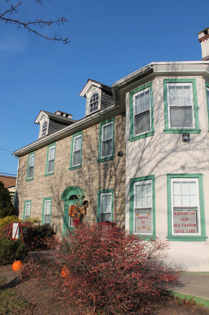
Unfortunately the bakery has been there for nearly two decades and many locals still don’t know the business exists. The signage was difficult to see and the building blended into the background. It didn’t look like a bakery. It looked like a private home.
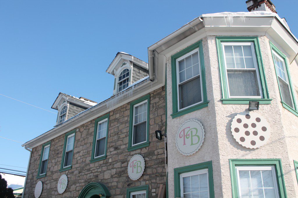
Exterior makeover. But, the most dramatic challenge for the design was the blizzard. With the blizzard our ability to work on the exterior was severely limited. And the exterior was the most important part of taking an unnoticed bakery out from being a wallflower in Flourtown to being a Save My Bakery success. My solution was to create signage that depicted bold images of sweet treats that we attached to the exterior. We also utilized the current posts for the signage and created a taller sign that included a clock tower. We removed the dead plants and created new flower boxes from Western Red Cedar.
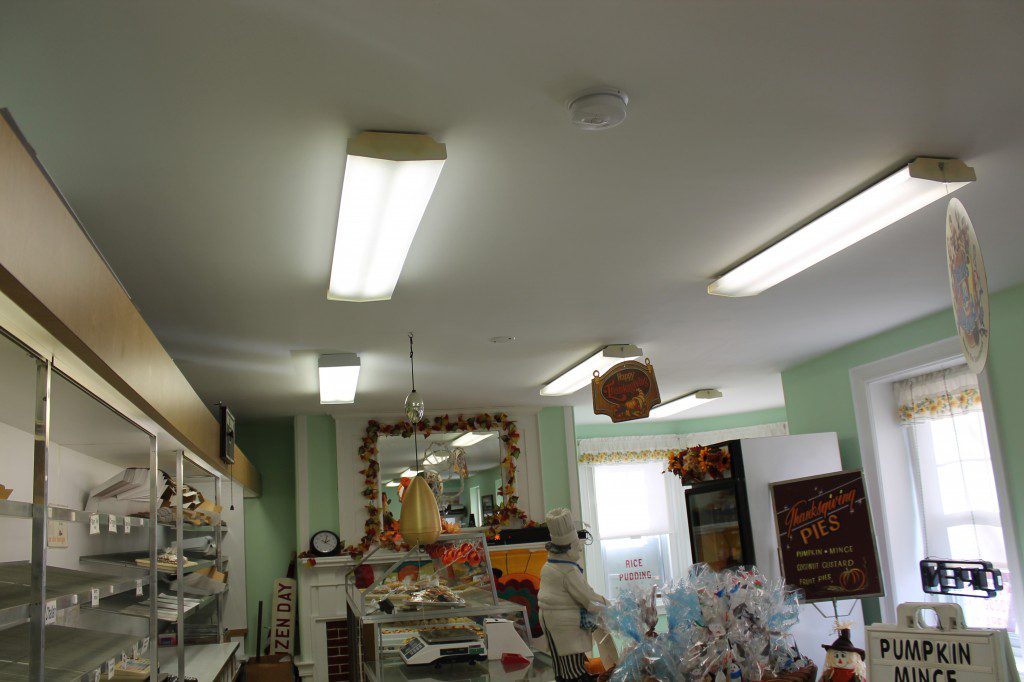
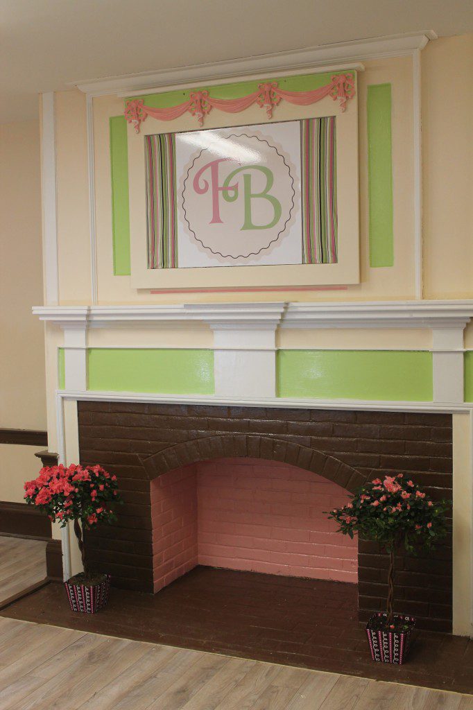
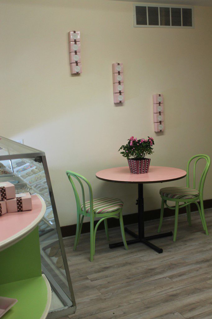
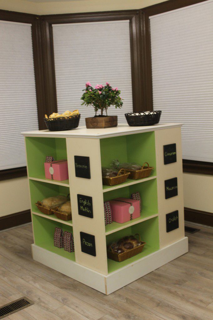
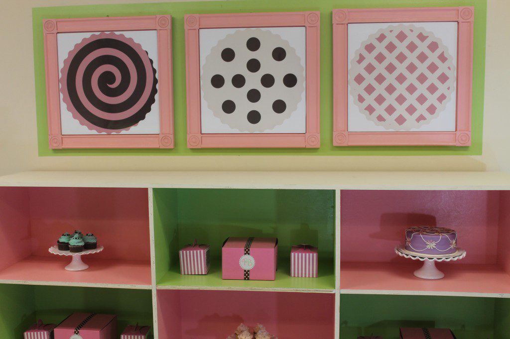
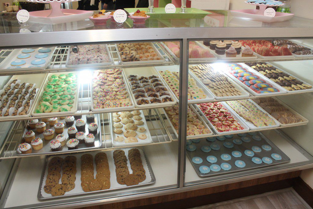
Floorplan. On the inside, my goal was to create more space for customers, to open up the area in front of the fireplace to make it a focal point, and to make the tower space usable. So we decluttered, removed the unused coffee station from the tower space and reoriented the bakery cases. We removed old shelving and built new shelving. And we put in a new floor in the customer area.
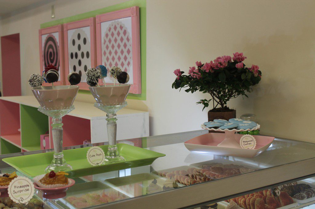
Color. I chose Hopeful Pink, Dancing Green, Plantation Brown, and Champagne from Sherwin-Williams for the bakery. We used Plantation Brown on the trim and fireplace, which created definition and richness to the bakery. Hopeful Pink and Dancing Green were used in the shelving, signage, and accents. Champagne was used on the walls.
