We tried to ‘Save My Bakery’ with a Neoclassic Coastal style
Makeover a struggling bakery in 48 hours? Mark and I (and a few of our talented remodeling expert friends) were up for the challenge. As Barney Stinson says, “Challenge accepted.”
None of the owners for the series had any say or idea of what we were doing to makeover the bakery. I had the opportunity to create what I thought would be perfect to create a more positive working environment for the owners mixed with a design that would attract their target customers. Fingers crossed at the curtain reveal each episode.
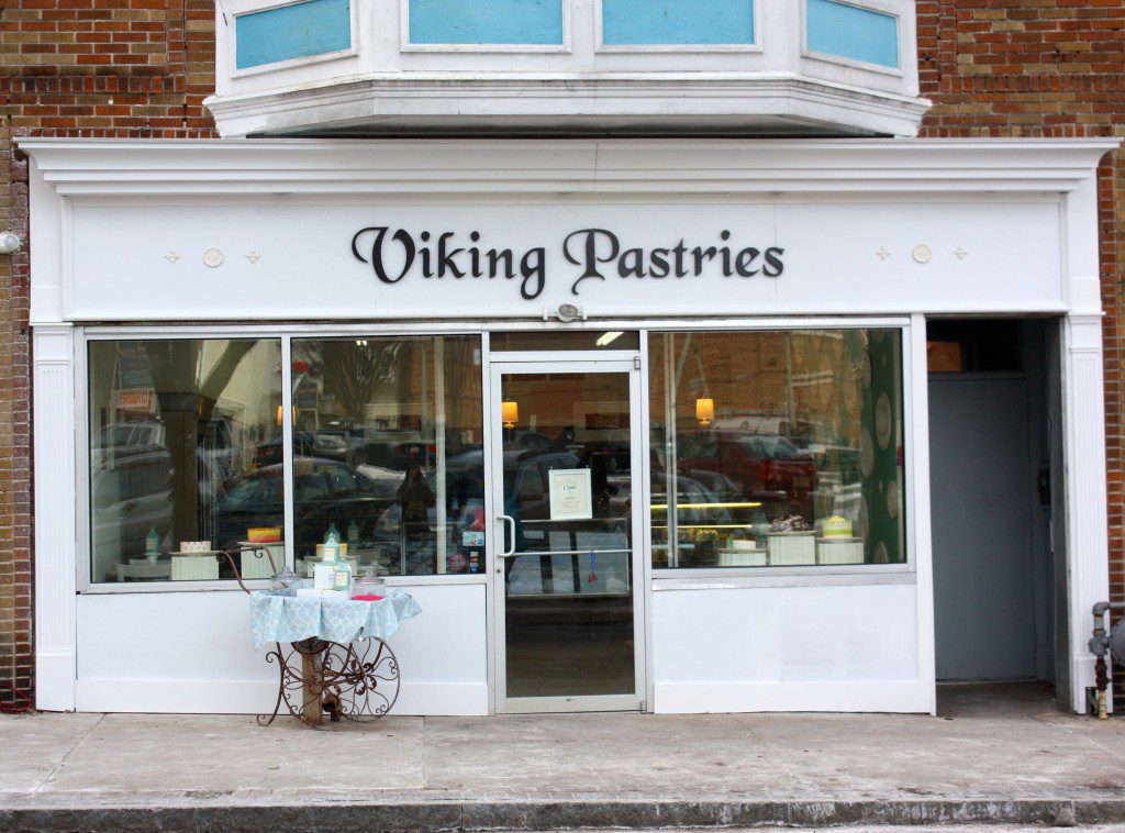
Here’s what we did for the family at Viking Pastries on Save My Bakery for Food Network.
The family at Viking Pastries inspired me. The family’s story of a suspicious disappearance of their son, and the inspiration of his daughter’s dedication to making the bakery a success.
They are desperate for a rebirth of their business, and they are in need of visual organization in their shop. And they love the two weeks they spend at the shore each summer. So they inspired the design theme that I call Neoclassic Coastal. We gave their shop elements from a neoclassic renaissance, but with a modern coastal twist.
The daughter, Angela, wanted more space and seating for the customers and to create an atmosphere that would attract families to want to spend more time inside the shop.
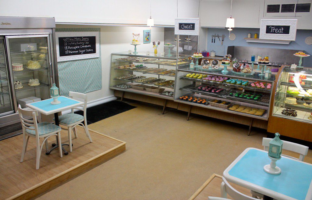
Floorplan. A new floorplan was essential in creating more space in the shop. Our construction team moved the cases in a new orientation, and built two seating platforms on either side of the front door.
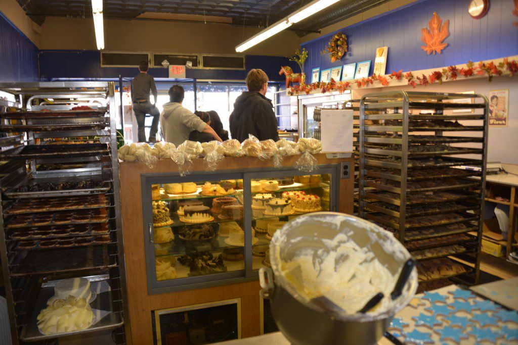
We also reorganized the prep area that is visible inside the front of the shop, to make the working area more efficient. And to make it easier for customers to watch the cakes and cookies being decorated.
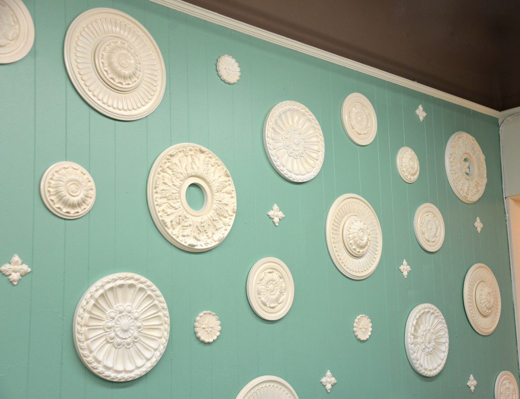
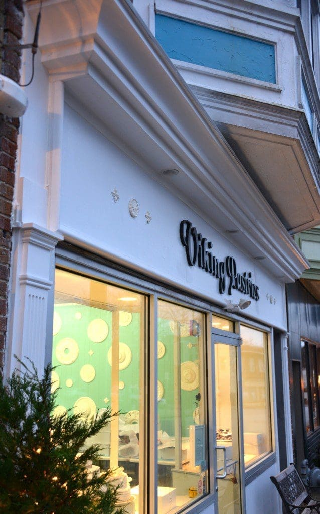
Feature wall. Bringing in the classic element of medallion and rosette, I wanted to use them in a new way. So I created a feature wall filled with medallions of various sizes on a blue background. The medallions have the classic look, but also bring a seaside look like shells on the water’s edge. We used polyurethane medallions from Fypon.
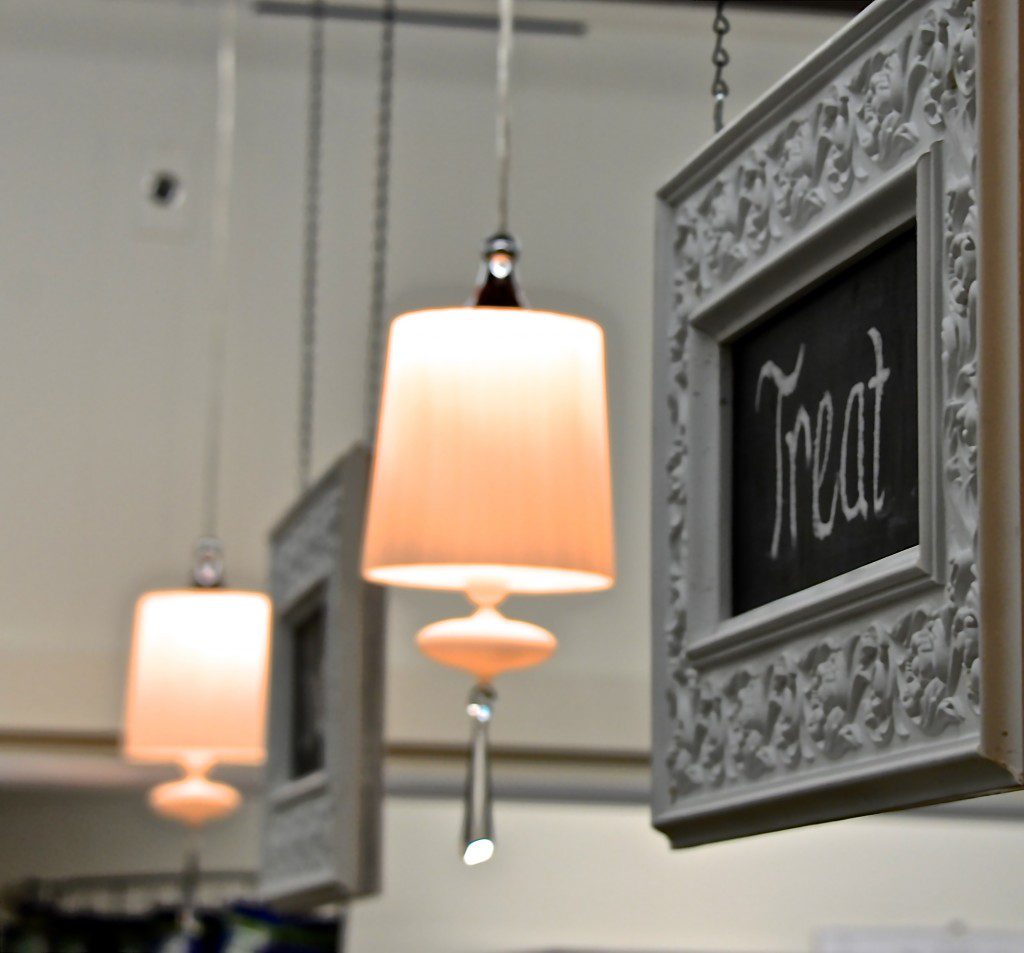
Lighting is essential in any bakery. Beautiful clean light makes the food look yummier, and decorative lighting helps to create the mood and style of the space. So I was delighted to find the Bisou pendant from LampsPlus for the counter lighting.
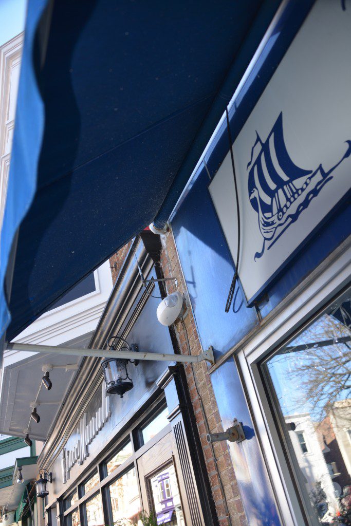
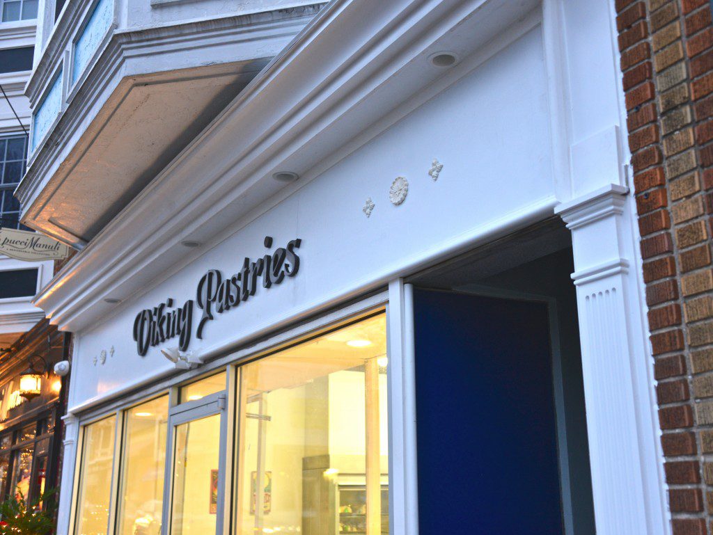
Exterior. The awning on the exterior was past its prime, and the Old English font was difficult for some to read. In keeping with the historic style, I chose an updated Old English font for the new sign and branding. It has a friendlier and bolder look for a modern bakery.
Accessories. Accessories to me are mostly functional for a struggling bakery makeover. With just 48 hours to makeover a bakery, and knowing the owners don’t have the resources to let any square footage not serve their bottom line, most of the decorative elements also serve as function.
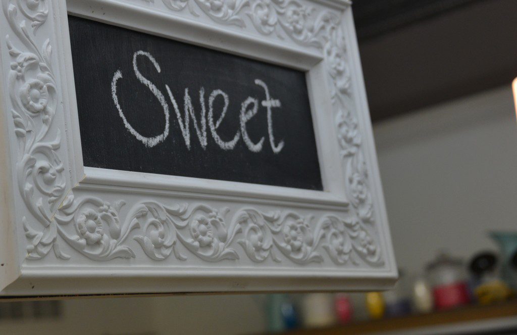
The chalkboard signs (created with Krylon‘s chalkboard spray paint) we created are framed in decorative molding and serve as a way to communicate specials or fun messages.
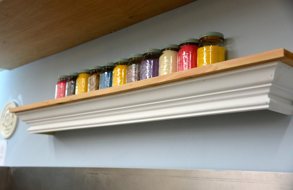
I used jars and other containers to use the bakery’s sprinkles as both a decoration and to eliminate the walk into the back of the kitchen where the boxes of sprinkles are contained. This was a big complaint of the decorators.
The chairs and tables were updated in the new colors of soft blue and seafoam with spray paint and fabric from JoAnn‘s.
Check out the before and after photos below. And head over to FoodNetwork.com to see how host Kerry Vincent worked with the bakery owners on their menu and methods of working together.
