
Ann’s Bakery was ready for a ‘Save My Bakery’ makeover.

Dated with overlooked and haphazard “make-do” décor, the bakery was founded in 1938 by Ann, grandmother to Shannon who runs the bakery.
When I talked with Shannon about what she wanted from the makeover, she shared that she had recently vacationed in Paris, and fell in love with how modern styling effortlessly combined with the historic elements of the bakeries that were centuries old. She said that she would love to have that type of design in her bakery, but does not think it’s possible. I knew it was possible. So I embarked on my mission to create a “nouveau petit parlour” for Shannon’s family business on this episode of ‘Save My Bakery‘ for Food Network.
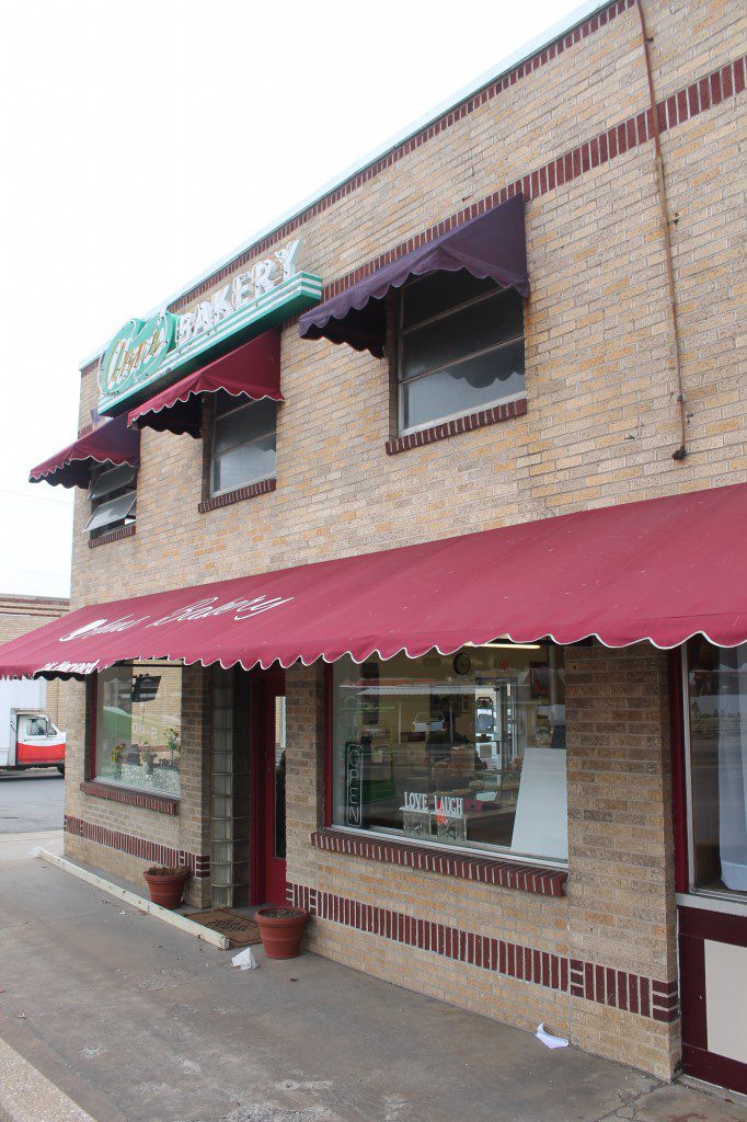






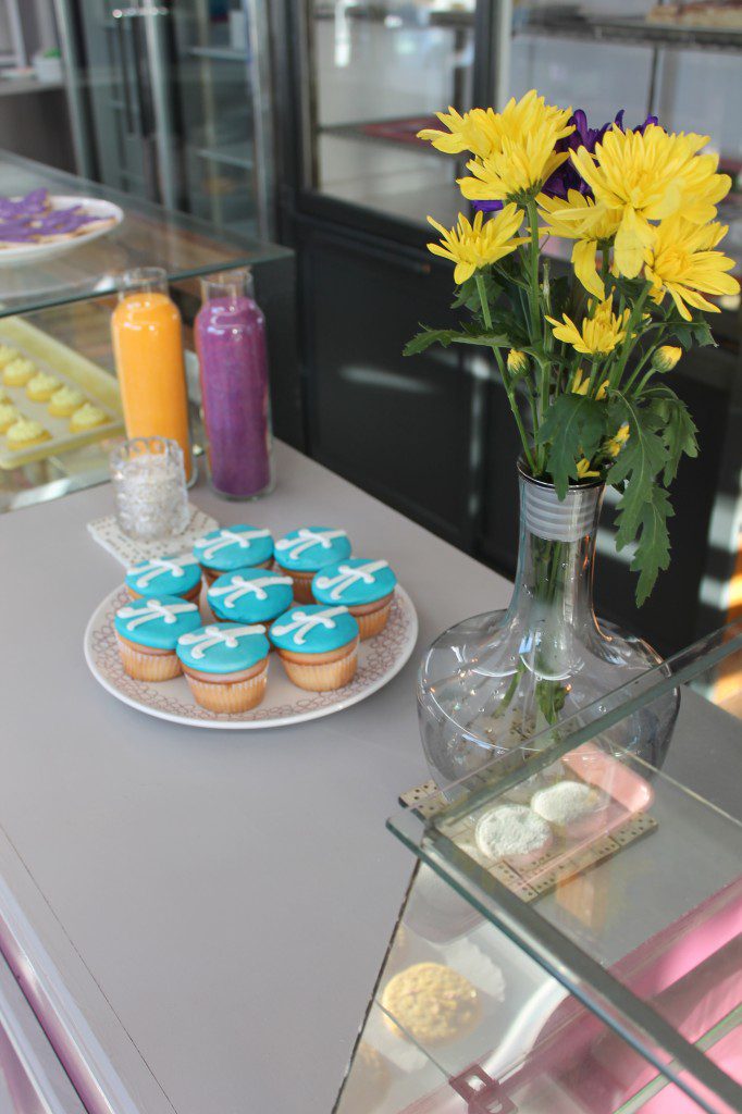
Branding. One of the first elements of the makeover I thought about was the brand of Ann’s Bakery. The green sign is iconic to the town. It is even a part of a feature wall art of local Tulsa signs at the airport. And everyone we talked with in Tulsa knew about Ann’s Bakery, and had a story to share of going there years ago for a wedding cake or a special event. While I wanted to give them new colors and a new look, I think it was important to keep that iconic green sign. So when choosing a new font, treatment, and color for the new logo, menu, and other graphics, I made sure that the new look would ‘go’ with the iconic Ann’s sign.
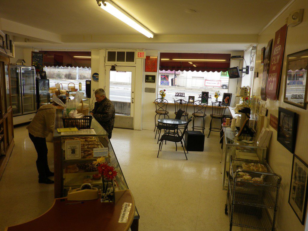
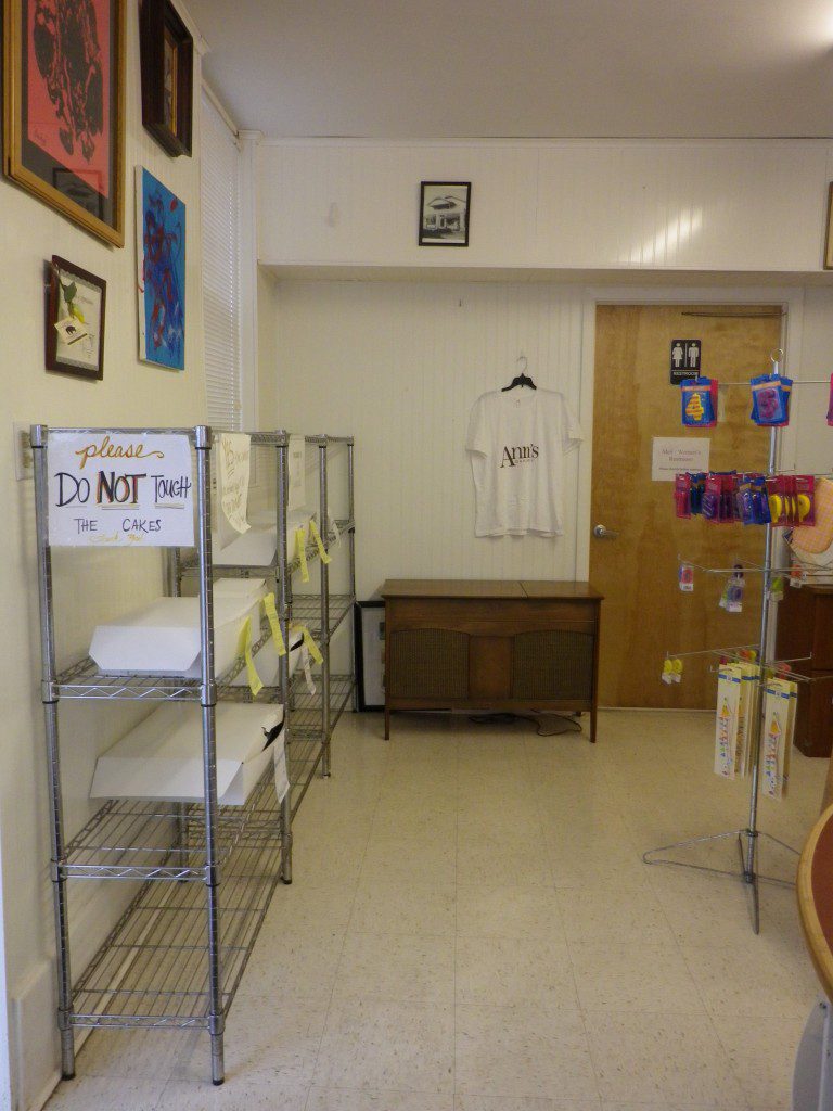
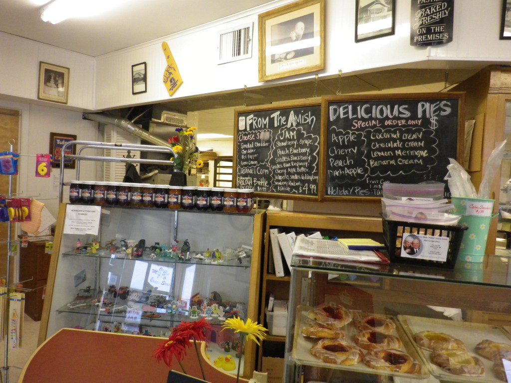
Floorplan. The floorplan was awkward. When customers entered through the main doorway, the first thing they saw were little plastic toppers for children’s birthday cakes, the back prep area, and the bathroom. If you turned to the right you saw coffee and wire shelves, if you turned to the left you saw a bathroom door. I wanted to change this experience. But, the bakery had several fixed elements that limited the possibilities to major design changes in a 48-hour window of work. In the front of the shop, there was flexibility, but the way that the space is divided between prep and showroom was fixed.
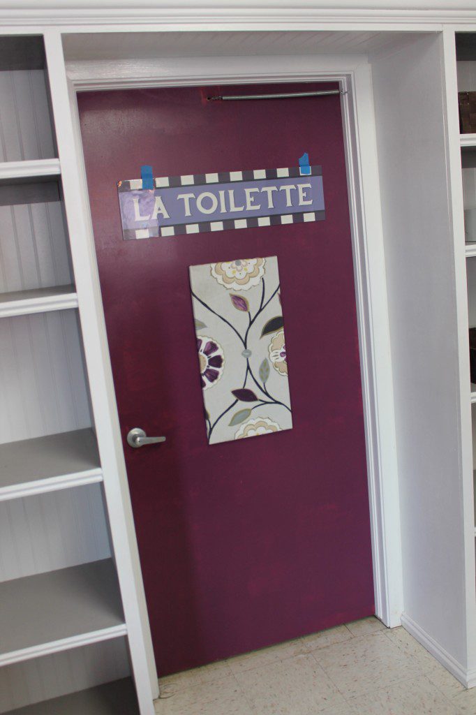
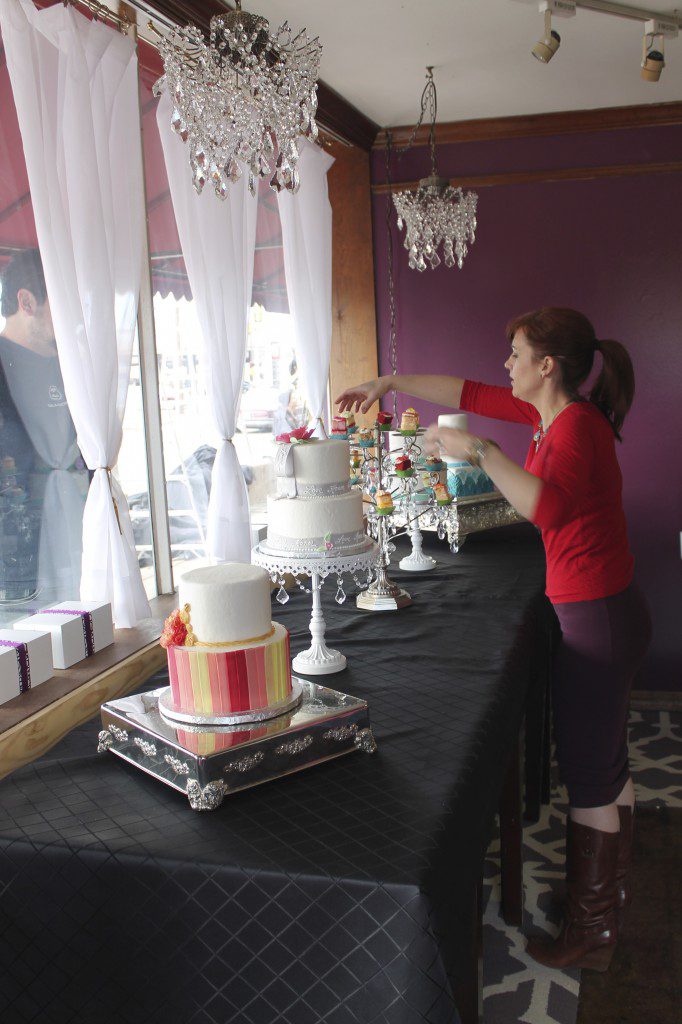
So the first thing I tried to do was move the refrigerator in a more prominent location, so the bakery could display its cakes to its customers. Then I wanted to open up the space for more comfortable customer seating. And I wanted to give them more counter space, a visual divider to the prep area, and soften the bathroom entrance by surrounding it with built-in shelving and a prettier sign. But most importantly, I wanted to create a space that would delight and charm the bakery family and the customers.




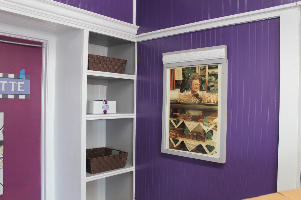
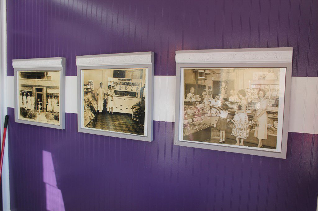
Décor. An important element that directed the décor in the bakery is Ann’s family. Family is essential to Shannon, and she values the history of her family and how connected they are to the bakery. I incorporated some of the family’s old photos as wall art, reproduced in a sepia-tone style that brings an old-world charm of a Parisian-style shop. I also reproduced a photo of Ann, and to highlight her importance to the bakery, her photo is the only one with color and the only one oriented vertically.




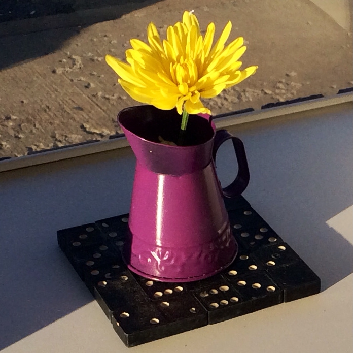
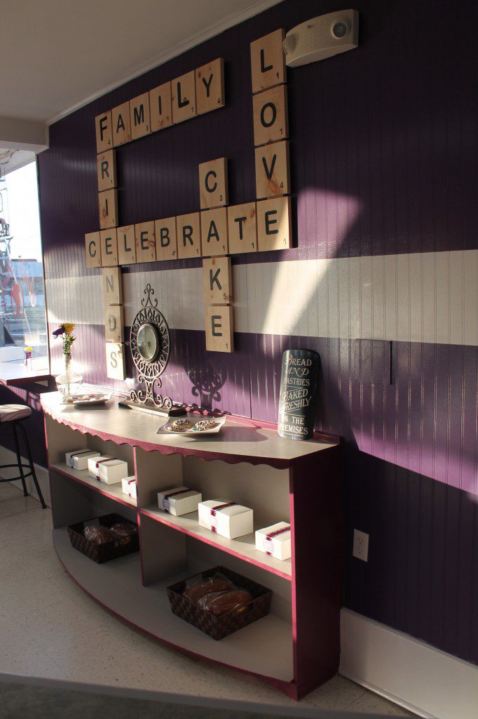
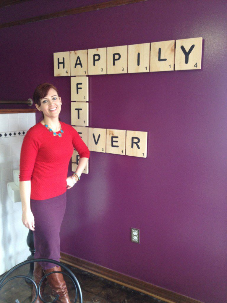
Ann’s favorite pastime was playing dominoes, and taught all of her kids and grandchildren to play. The family gets together regularly to play board games. I’d like to bring the sensibility of the Parisian bakery with charming decorative elements of oversized game pieces as wall art and as accents throughout and intersperse vintage games to adorn the Ann’s bakery. We used vintage dominoes, glued together, as coasters and centerpiece elements. And we created scrabble wall art in both the bakery and the wedding room.


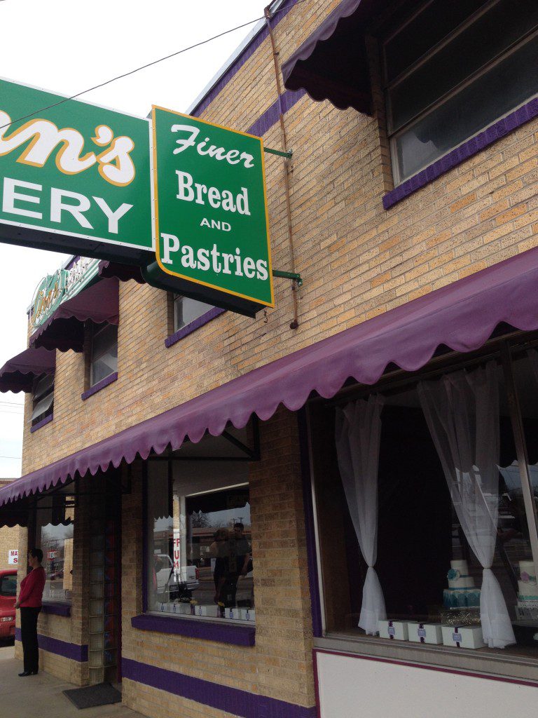
Color. Ann’s Bakery is the largest bakery we had to makeover in 48 hours for ‘Save My Bakery.’ It was a large undertaking, and it defined the scope of the work. Knowing that we wouldn’t be able to paint the entire façade of the building, I decided that updating the awnings in a new vibrant color would be ideal. I chose Krylon Colormaster in Gloss Purple for the awnings. The red brick striping around the building was painted in the same dark purple as the awnings.


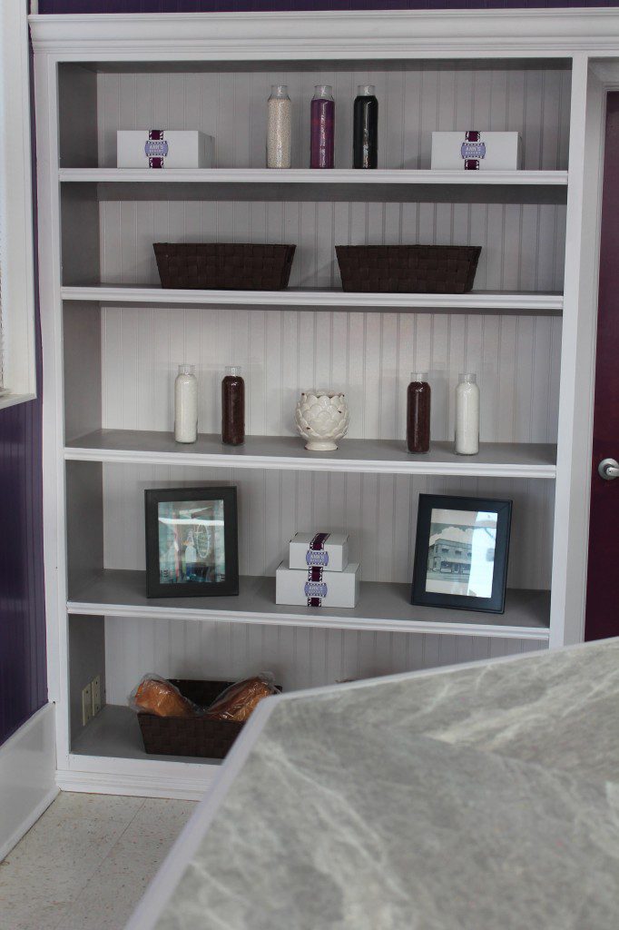
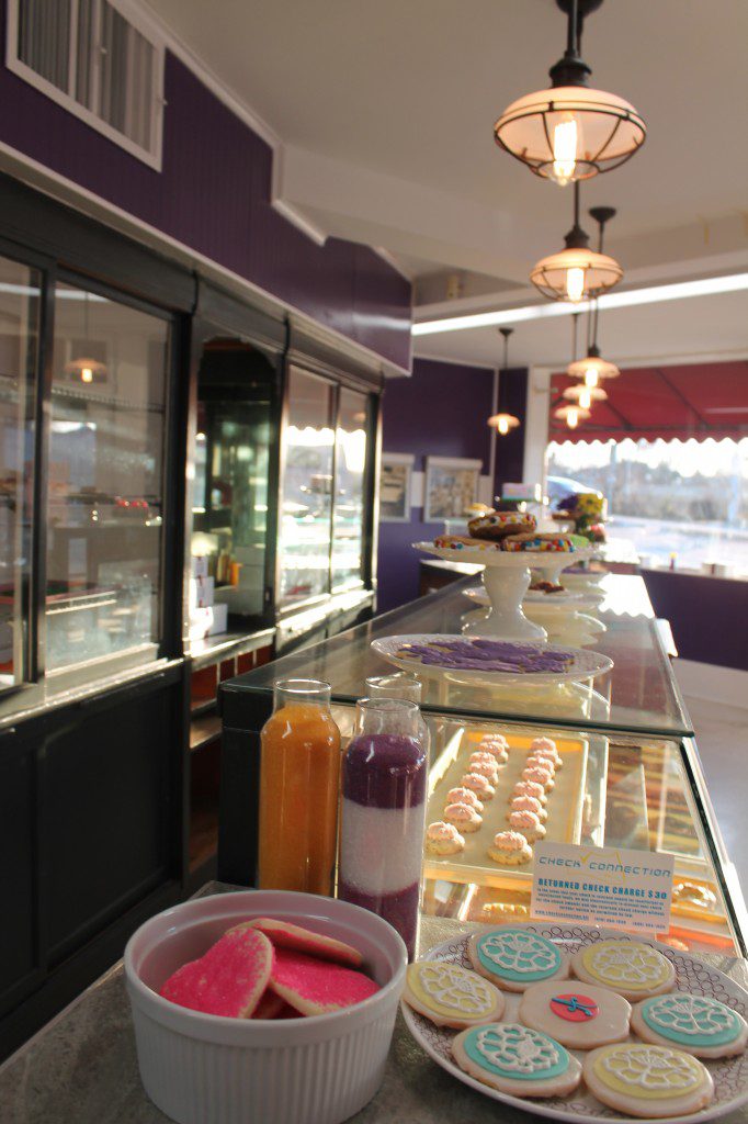
In order to bring the old wood bakery cases and display shelves that had seen better days to a more modern feel, I chose an almost-black color for the outside of the cases and for the inside of the cases I chose a cream. We carried the rich purple from the outside of the bakery inside the bakery, using two shades of purple. And created a stripe on the inside walls to mimic the stripe on the outside of the building, but in a reverse color scheme.
Lighting. The lighting in the bakery was a bit harsh, more like a cafeteria lighting scheme than a warm family-owned bakery. For the exposed fluorescent lighting in the bakery, we trimmed them to soften the look without sacrificing the function. And we added five pendants over the bakery counters. They have an oil-rubbed bronze finish and a soft white glass. These pendants help create a sense of place and intimacy at the bakery counter, while adding the mix of on-trend and old-world styling that Shannon desired.














Wow Faron! Thank you so much! We’re so happy to be part of the journey. You’ve made our day.
When I saw you at the bakery I knew y’all should be in front of the camera as well as behind it. The family is so grateful and impressed with your hard work and feel it’s the best of the series.