
Rose Quartz pink and Serenity blue are more versatile than you may think.

Pink and blue sound better suited to a nursery design than any other room in a home. I think the colors are way more adaptable, and even can enhance your personal style, from rustic to luxe.
In everything in life, it’s about context and presentation. The Pantone colors of the year 2016 are more than just a reaction to our current culture need to be nurtured and create a sense of diversity acceptance. The colors of Rose Quartz and Serenity actually do have a calm, soothing feeling. And they also are challenging us to have ‘color acceptance.’ Yes, I just made that up. For me, color acceptance means that red-white-and-blue is more than just for the 4th of July. Green and red doesn’t always make us think of Christmas. And pink and blue isn’t just about babies.
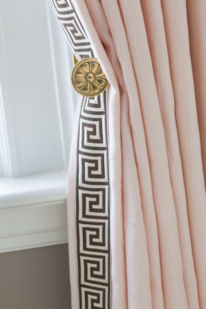
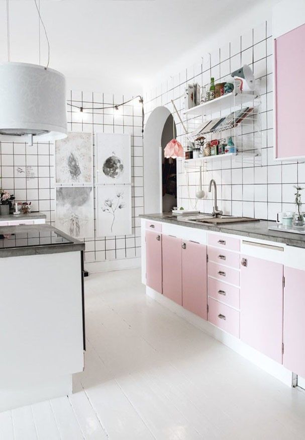
I’ve gathered a few diverse ways that designers are using the Pantone colors of the year in interiors that showcase almost every popular home design style.
So you want to add some happy to your home office? A wall of Rose Quartz can definitely add a bit of cheer, without making you feel like you are in a nursery.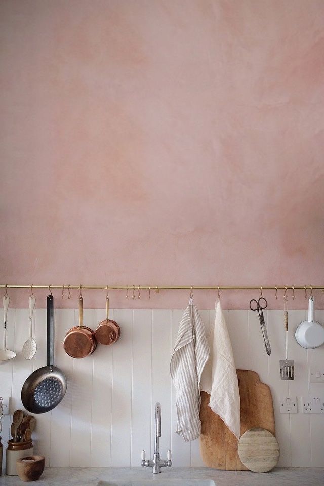
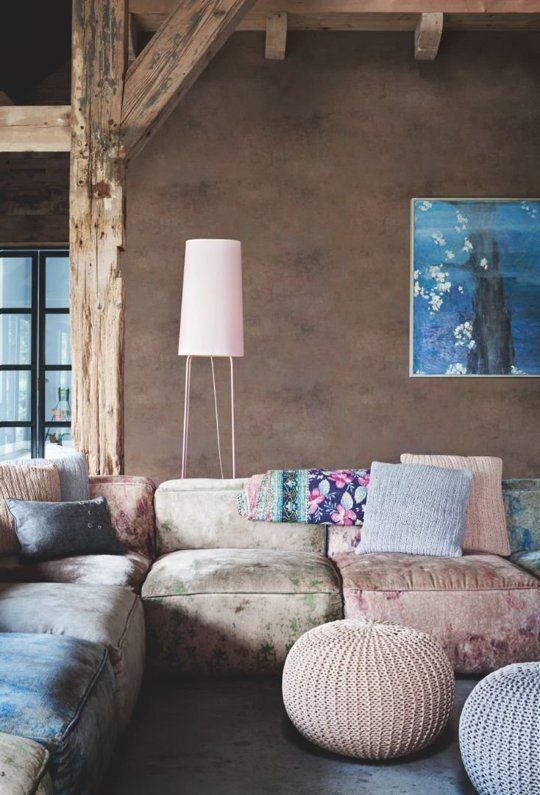


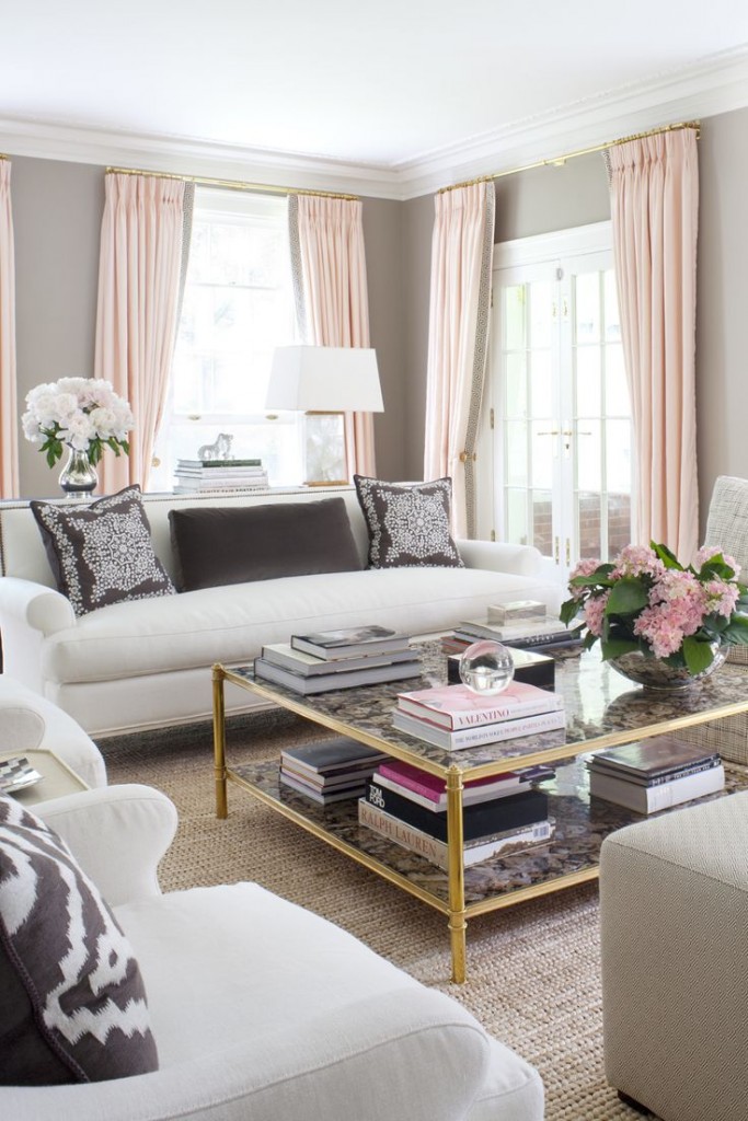


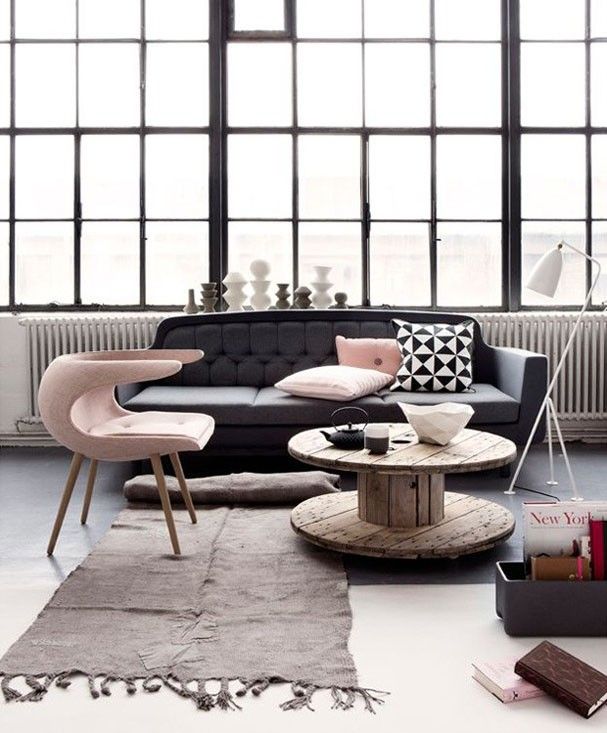






What do you think of the Pantone colors of the year?
Join us on Wednesday, January 13th at 1:30pmET for #HossColor chat to talk about the Pantone colors of the year on Twitter.
Here are the questions for the #HossColor chat:
- What do you think of the Pantone colors of the year?
- Have you ever used the colors, Serenity blue and Rose Quartz pink, in your home? Show-and-share images.
- How can Serenity blue and Rose Quartz pink be used in a sophisticated home?
- What do you think Pantone will select for next year’s color of the year?


[…] experimenting with paint and patterns, so when I heard that the Pantone colors of the year were a Tranquil and Serenity Rose, a soft blue and pink, I wanted to use them in a lace […]