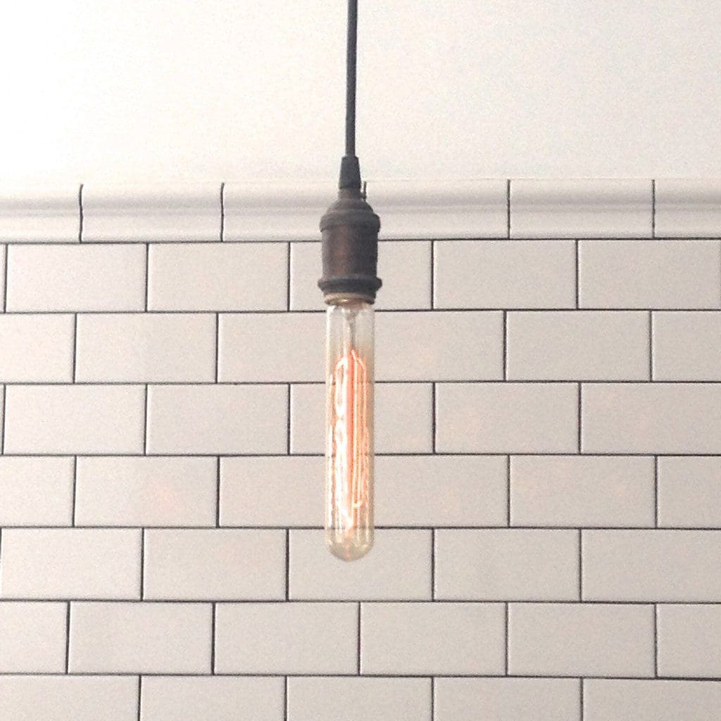
Why are some retro design elements like the Edison bulb and subway tile so loved?

My mind spins when I think about 3D printing, and that our almost kindergartener Jack will be using an iPad instead of books at school.
So I get it. I get the throwback to retro. It’s like putting on a much-loved shirt that’s soft with so many wears-and-washes. It’s soothing in a way to go back to before we had to sync our calendars as a family on all of our devices just to keep pace with life.
Usually I’m a fan of using touches of antiques or retro pieces as part of a complete design. Most everyone has mementos and family heirlooms that we want to keep in our homes, as reminders of our history and loved-ones who are no longer around. And our spaces are reflections of the people inside them, so why not nod to the past while balancing inspiring elements that keep us looking forward.
So when I saw two retro trends that have been trending for a few years paired in a restaurant in NYC, it got me thinking. With the advances in lighting, why do we keep loving the Edison bulb? And with the advances in surfacing materials, why do we keep finding Subway tiles appealing?
And when is retro too much? When you have two? Three? Or does it really ever matter?
With the Edison bulb dating back to the 1880s, and white subway tile dating back to the opening of the New York City subway system in 1904, they were both created for utility: to create a long-lasting light source and as an easy way to keep subterranean spaces clean.
But with the advances in lighting that lasts much longer and with the advances of surfaces that provide many options for easy care, the Edison bulb and the white subway tile are still so loved.
Maybe it’s in the decluttering of visual texture that we find the look so refreshingly simple.
What do you think?

