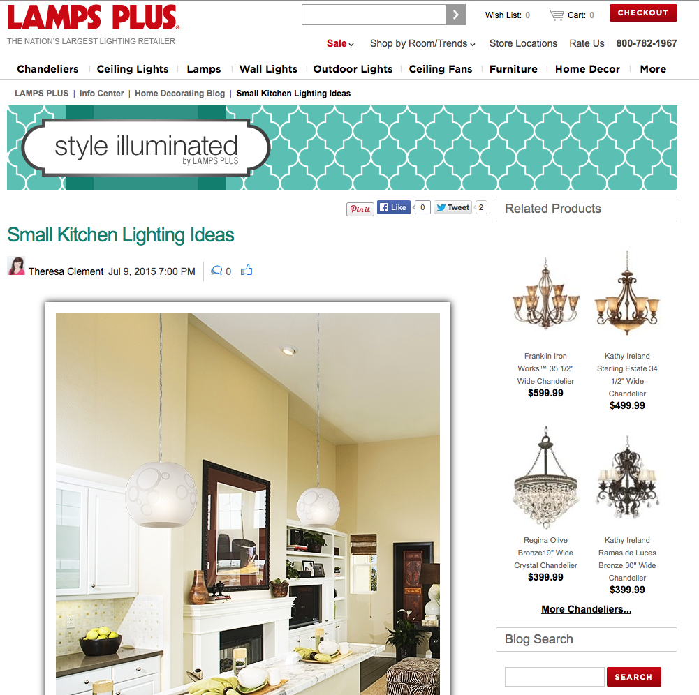
If you have the small space blues, let’s talk design tips to help make a small space look larger.

With a keen eye on selecting elements that are scaled to the space, have sleek style, and smart placement almost any material and design element could work in a small space, and can even make a small space look larger. Problem is that not all of them can fit in a small space at the same time.
Get exclusive. Kitchens are the center of many a busy family, but that doesn’t mean it’s the ideal place to do homework, open mail, pay bills, wrap presents, or check up on friends on Facebook or Twitter. Bounce everything out of the kitchen that isn’t food related to another part of your home.
Avoid break-ups. The longer the run of counter, flooring, wall color, the less your eye stops and starts. Punctuating a counter with changes in elevation to accommodate food prep versus chair height for eating, or an active floor pattern with color or size changes can take a small kitchen and make it seem cramped. The design tool of punctuating the visual plane is better used in a large kitchen, when you want the colossal space to seem cozier.
Light it right. By ‘right,’ I mean carefully and strategically. If your design intention is to make a small space look larger, then keep in mind ceiling height, and traffic flow. It can become a bit of a hilarious obstacle to traverse a kitchen when there’s a light hanging down past most grown-ups heads. Under-cabinet lighting, close-to-ceiling fixtures, and recessed lighting are most everyone’s go-to choices when lighting a small small like a kitchen.
I shared a few ways that chandeliers, pendants, and other light fixture types can help make a small space look larger and work in a small kitchen on LampsPlus.com.
Head over to check out this blog. I’d love to read what you think in the comments section below, or jump on Twitter and talk to me right now. -T


[…] Tip: Since this is a single vanity cabinet, I didn’t have to label the doors. If you’ve ever painted kitchen cabinets, it can be […]