
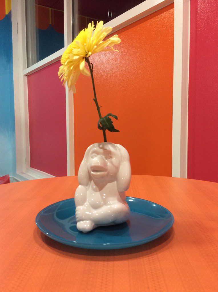
When a client says she the only thing she likes about her space is a monkey statue and her business is called Cake Crazy, I know we will be having some design fun on this ‘Save My Bakery’ makeover.

The fun mother-daughter team at Cake Crazy exploded with personality and a hard-working attitude. But their bakery didn’t show any of that.
When the daughter Tyann moved her business from Texas to Oklahoma, she changed her bakery’s color palette from orange and pink to orange and black.
The reason? Her mom Susan said she would attract more customers from the local college. Has it worked? It didn’t seem to matter. Did it make her happy? No way.
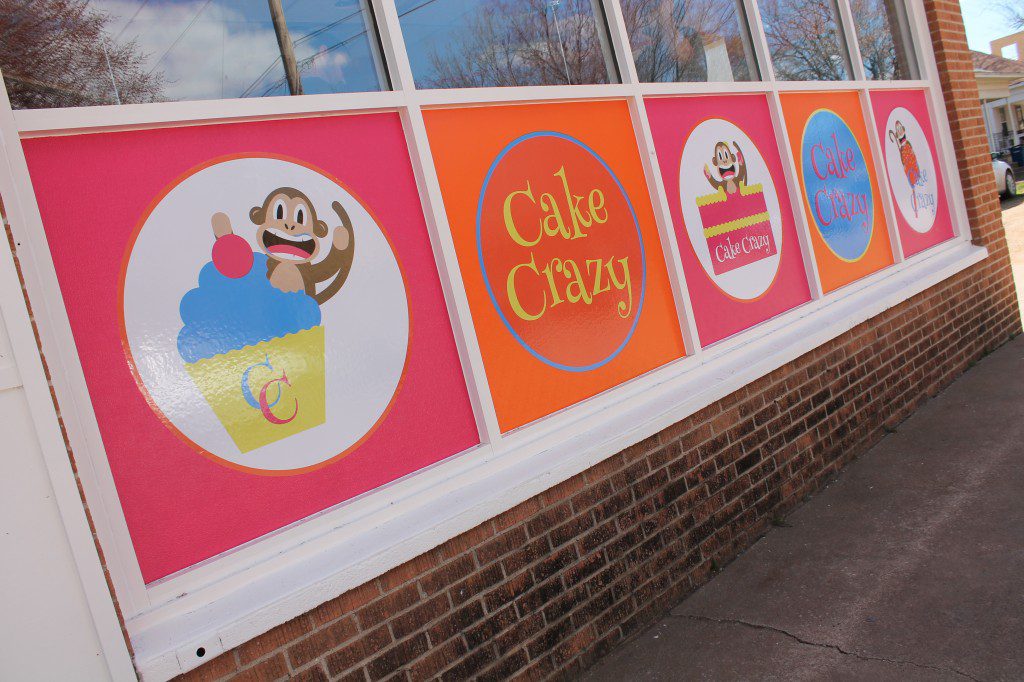
Branding. The first step I took to makeover the bakery was to look at the branding: the colors, font, and presentation of the bakery’s image. The monkey as part of the brand was a must from the second she said ‘monkey’—it’s just too good. I also thought the bakery should go back to its original color scheme of bold pink and orange. With the colors and the monkey, I immediately wanted to create a ‘big top bold’ theme for them.
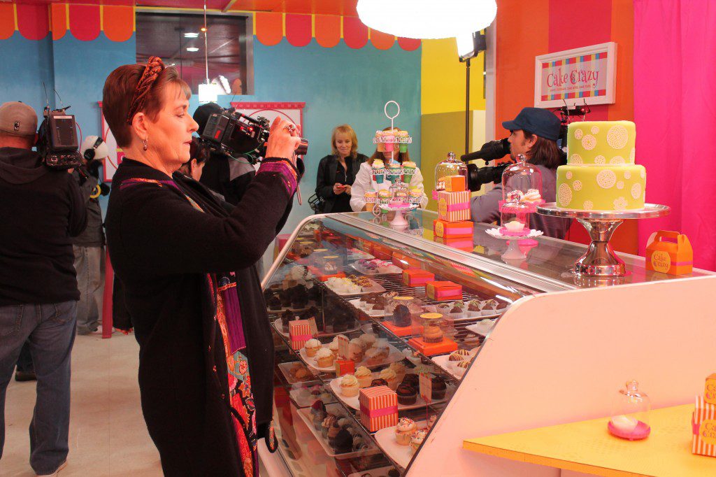
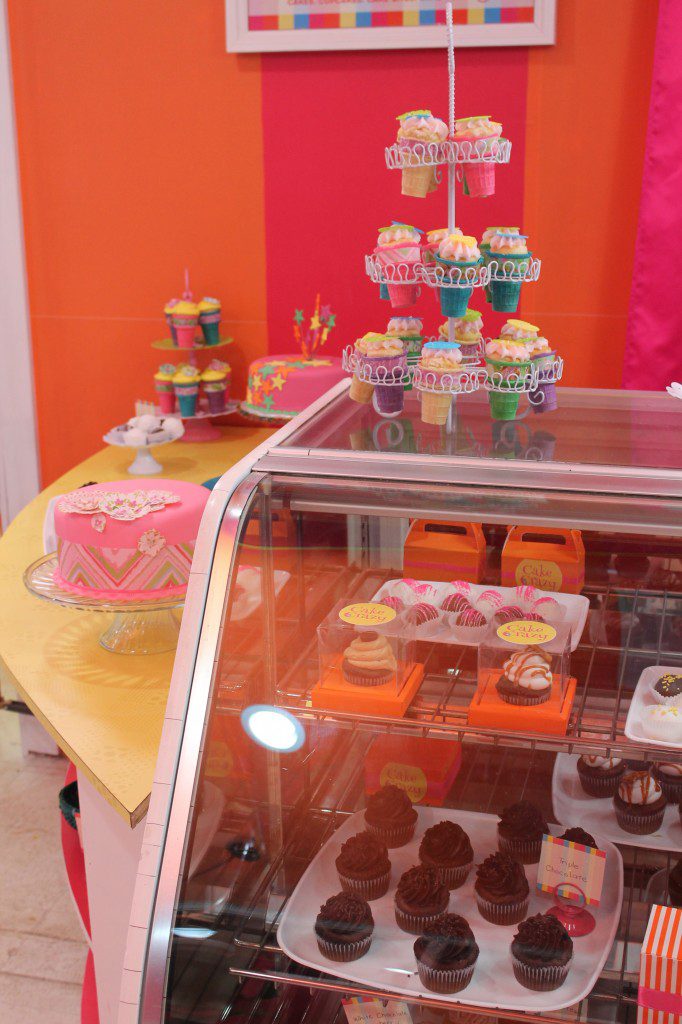
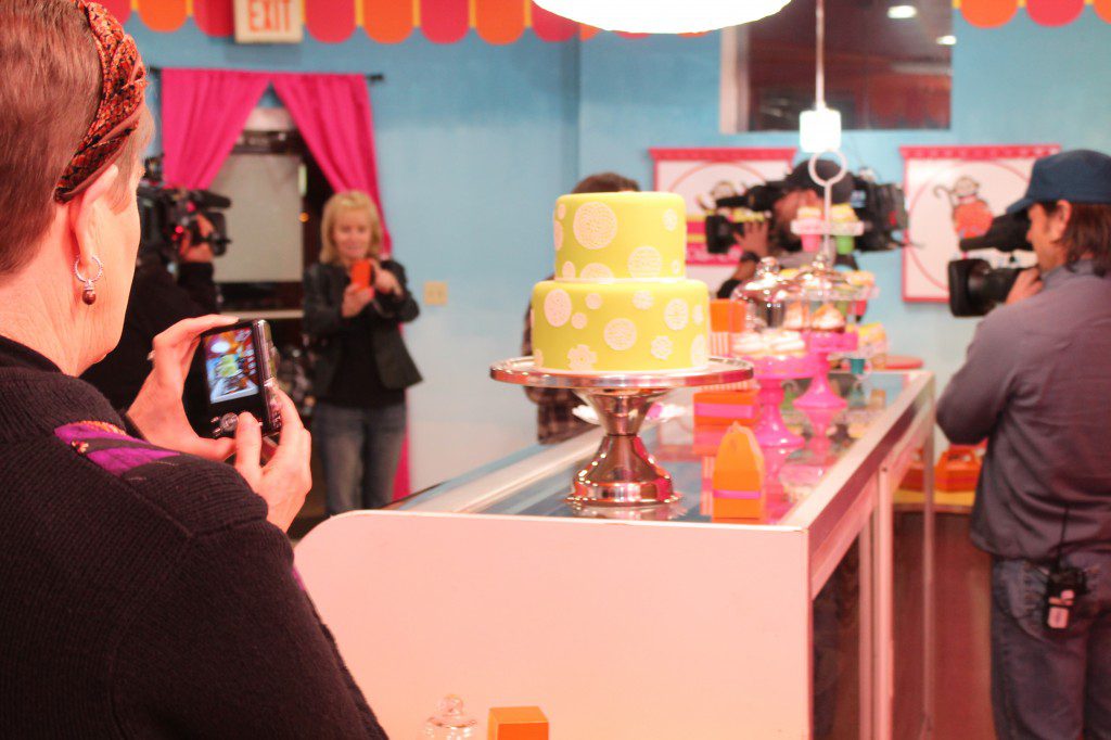
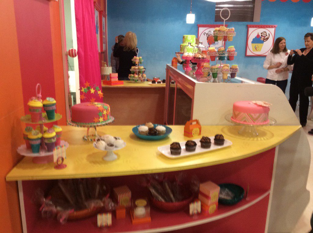
Color. For this ‘Save My Bakery’ makeover, I chose Ace Hardware’s Clark + Kensington‘s paint in Dragon Fruit and Poppy Fields as the main colors. We created a stripe pattern on the ceiling to give an affect of a circus Big Top, and then bringing in blue in an ombre affect on the walls to gives the feeling of being able to see the sky outside the tent. The windows in the bakery were higher than eye-level, so the blue ombre helps give a feeling of a view where there isn’t one. I also brought in yellow as an accent throughout the bakery. We used Formica Corporation’s Anniversary Collection in Citrus Halftone and Tangelo Dotscreen, and custom wallpaper from Customized Walls in the same colors as the Clark + Kensington paint.
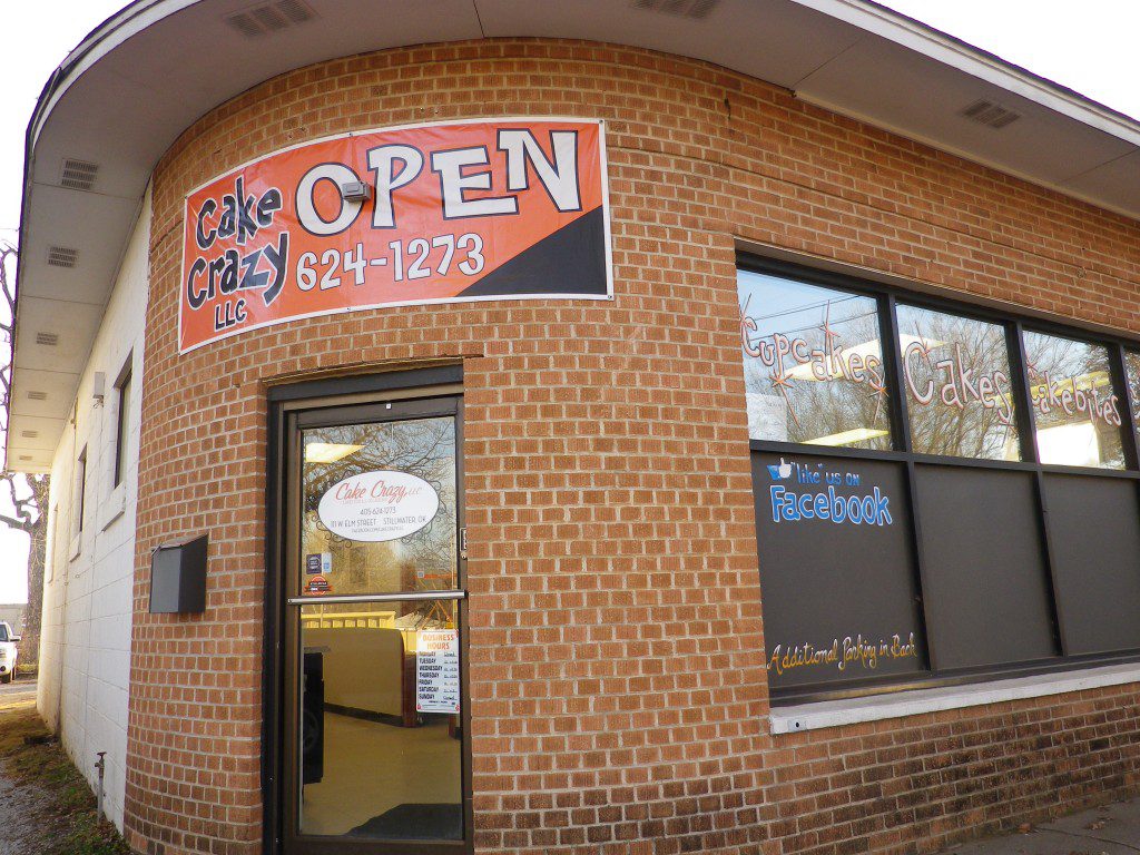
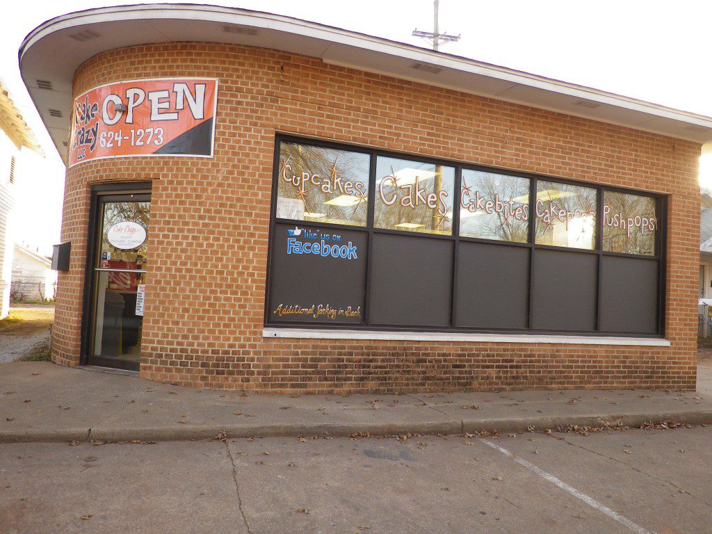
Exterior makeover. Cake Crazy was tucked behind another business, off of a main road. It was mostly brick with a modest sign over the corner doorway and it was hard to read from the street—the opposite of what you want in a sign. And nothing about the exterior said ‘bakery.’ It could have just as easily been a storage center, pizza place, laundromat or pretty much anything else.
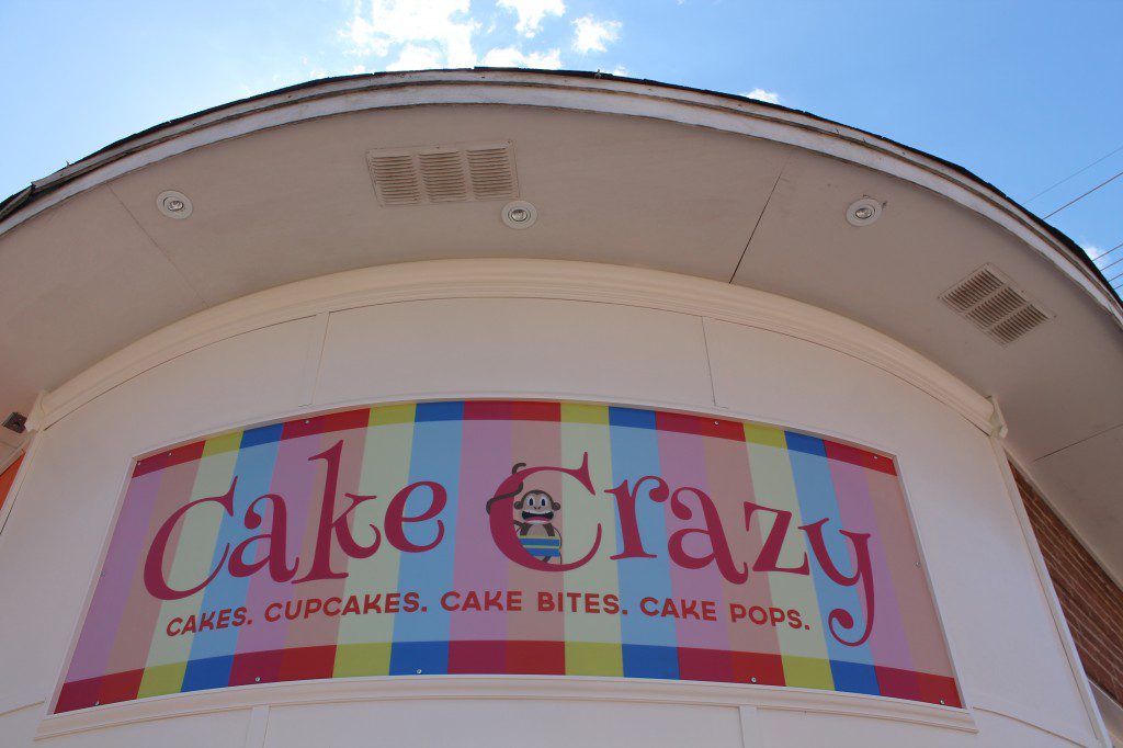
To makeover the exterior, we painted the exterior orange on one side of the building. We then created a grander entryway wrapped in detailed Fypon molding. We added crown molding on the exterior. And, using the new branding, we made a larger sign over the doorway. Along the street, we added a series of monkey art featuring the bakery’s specialty items: cake pops, cupcakes, and cake. In each image, the monkey is going ‘crazy’ when he sees the cake. The little monkey is ‘cake crazy.’
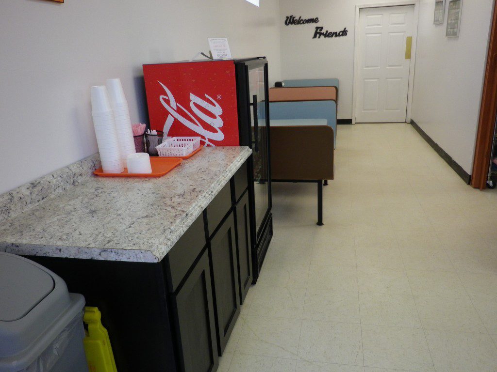
Interior makeover. My first reaction when I saw the interior layout: this ‘Save My Bakery‘ will be a challenge. The showroom area was L-shaped. One part of the L was where they had their bakery case, cash register, office, wedding consult area, and lots of cake tins and decorations for sale. It was cluttered. And not a space that any bride I know would want to be when she picks out her wedding cake. The other part of the L had old dingy, bad-diner booths. NOT an inviting place to hang out, especially when they say their target market was college students.
I wanted to give customers more space. I wanted the brides to feel special. I wanted the people who worked at the bakery to feel happy to be there.
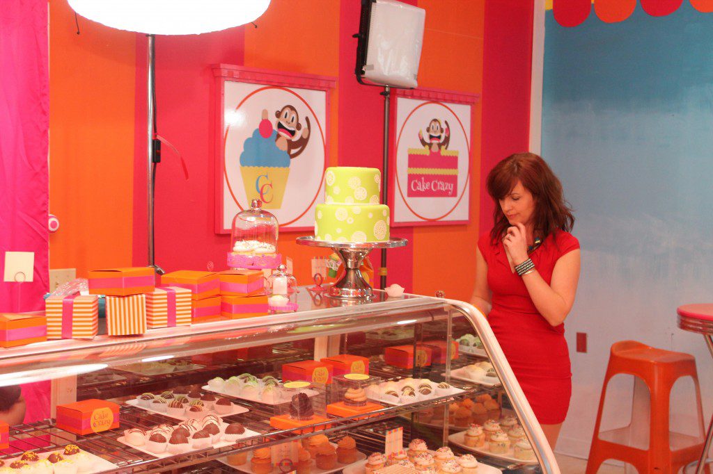
So the first step was rearranging everything in the showroom. Nothing stayed the same. I put the office in the back of the bakery, where it should be. Customers don’t need to watch them doing their bookkeeping. I decided to create a new opening in the wall from the kitchen to the showroom, which is where I placed the bakery case, phone outlet, and two new counters for display. So the walk from the kitchen to display was shortened.
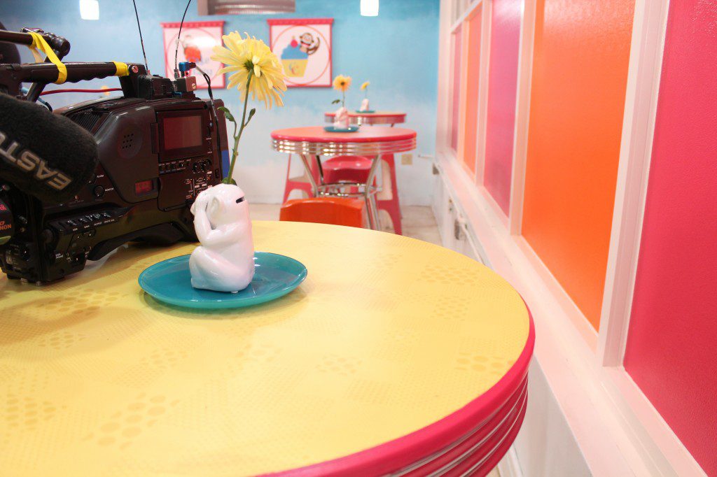
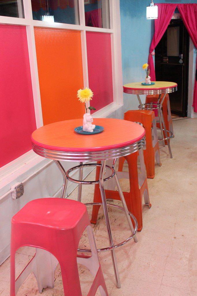
I also moved that wall back into the kitchen to give the front of the shop more space. We added diner style pub-height tables that we customized with Formica Corporation Anniversary Collection tops.
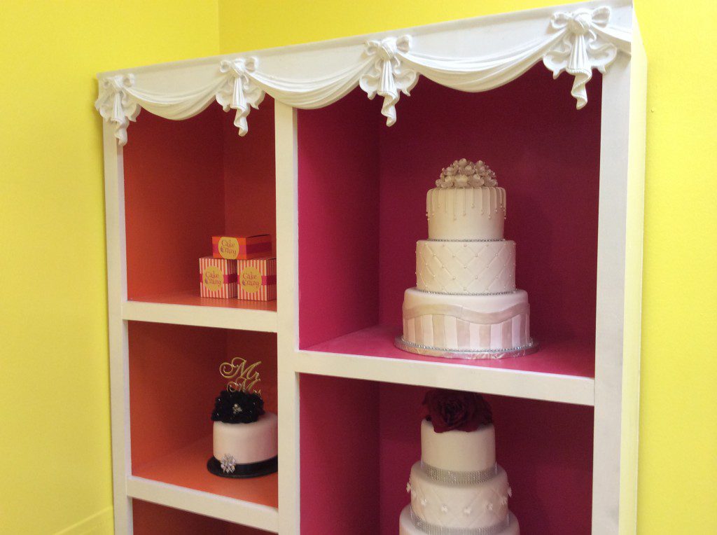
In the smaller part of the L, where the customer seating used to be, we created a space for cake consultations. We built custom shelving to display their wedding cakes, and their cake books so customers could look through them during consults.
Lighting. In any space that suffers from harsh fluorescent lighting in a dropped ceiling—and no windows letting in natural light at eye-level—it can be majorly mood-altering to change the lighting plan. I wanted to make sure the lighting was functional and fun. So, we used the Oveal Collection Acrylic from LampsPlus over the bakery counter and used a Fypon ceiling mediallion as the focal point of the ceiling striping. And the electricians hung new pendants over the customer tables around the perimeter of the room. The electricians also replaced the fluorescent lighting with new recessed lighting, so that it would be warmer light and not compete with the ceiling stripes.
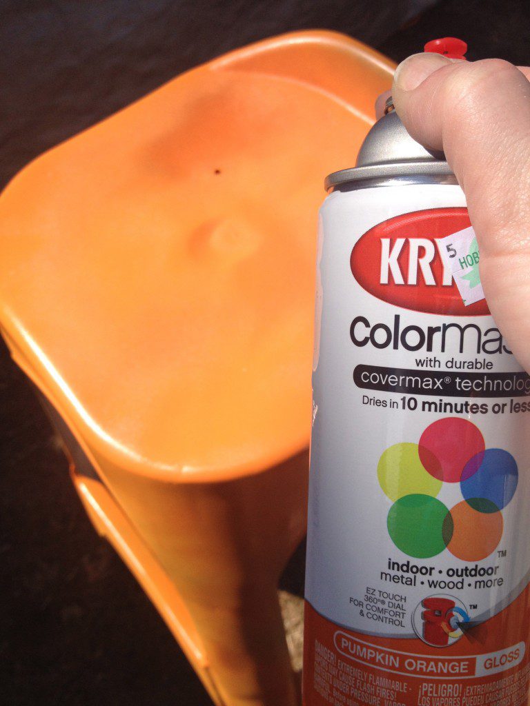
Décor. We used the RealComfort Barstool for the customer seating in the front of the shop, and painted them with Krylon ColorMaster paint. For the stools at the cake consult area, I used wood stools from Wal-Mart and painted them pink and white.
I used the custom wallpaper to add color to the wall behind the bakery counter, and to create scallops around the top perimeter of the bakery to enhance the ‘big top’ look.
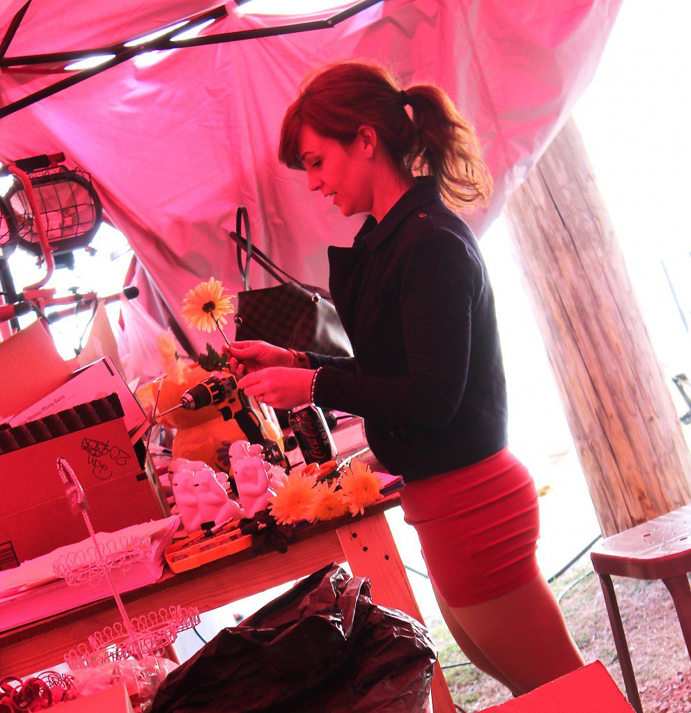
To bring the monkey theme through the bakery, I purchased a few sets of ceramic monkey banks, drilled holes in the tops, and then put flowers in the tops. We also decorated the interior walls with the custom monkey art that appears on the exterior of the building.
When the owner saw the ‘Save My Bakery‘ makeover, Tyann exclaimed that her monkey had babies all over her bakery. She was delighted.


















]













I absolutely loved this makeover! I thought the bakery was just stunning! I have a few questions about the blue walls you painted to give the look of clouds/the sky. What colors did you use? And what technique did you do to get that Ombre effect? I would love to try to do that in my daughter’s nursery, but am a little scared to attempt it! Thanks 🙂
Hi Marlita! Glad you enjoyed the makeover. I picked one color strip from Clark + Kensington paint, and then blended the colors from top to bottom to give that ombre effect. So I applied the colors like stripes, and worked quickly, so the paint is wet enough to blend.
One way to make it easier is to first cut in the top of the room and paint a few inches around the perimeter in the darkest color. And cut-in the bottom of the wall with the lightest color. Then add more of each to blend into the other colors.
I’m planning to post a how-to soon with photos. The colors I chose were Bistro Blue, Inner Coastal, Yea Baby, and Icy Pond. Best of luck to you with the nursery! And happy mother’s day. xx