
The father-and-son at Holmesburg Bakery couldn’t agree on anything, but they agreed that they loved our steampunk ‘Save My Bakery’ makeover.’
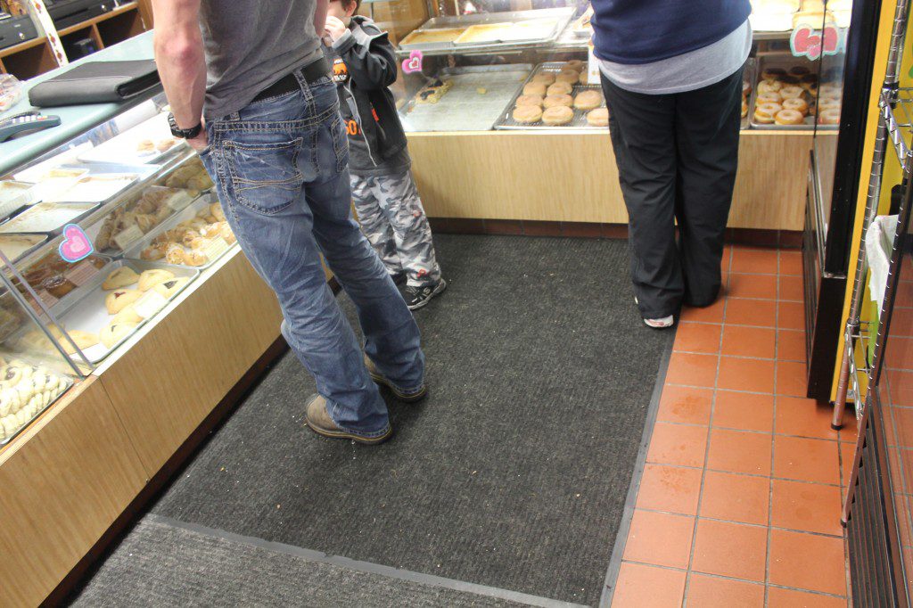
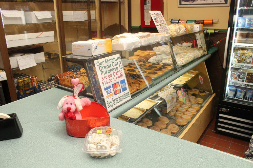
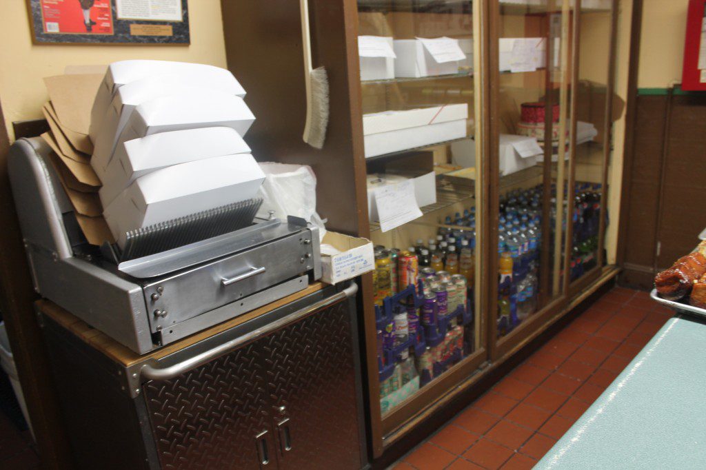
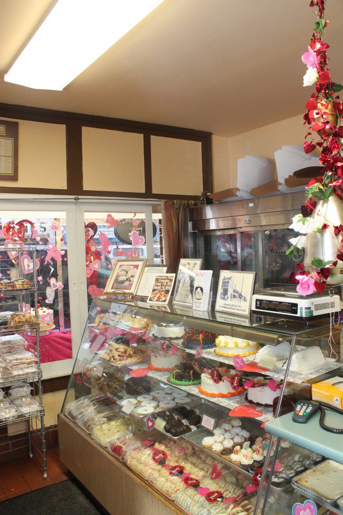
Holmesburg Bakery needed a vibe of calm. The energy of the space was disjointed and hectic. And it showed all too well in the layout and decor of the 114-year-old family owned bakery.
The father-and-son couldn’t even agree on what to do about the broken refrigerator and the broken shelf. So they just stayed there, in the front of the bakery.
The son left the family bakery business for a while, and went into the tech world. So when his father announced he wanted to retire, Buddy returned to the bakery and brought his high-tech skills with him. This included a surveillance system that caught me talking with the father. I immediately got a call from Buddy while standing in the front of the shop, and was told to not listen to his dad. I can say that was a design first for me.
So to say they didn’t agree was an understatement. And for my small contribution to the health and success of their family-run business, I wanted to give them a more calm and meditative environment to work in. And create a signature on-trend look that would attract more regular customers.
My idea: Combine the elements of textural light wood tones with trendy yet traditional-looking steampunk elements to bring this 114-year-old bakery into its next heyday. I call it ‘Industrial Organic.’
The first step was to remove the broken refrigerator, rearrange the old bakery cases, drink refrigerator, and make a plan to fix the broken shelf. This increased the floor space by five-fold immediately.
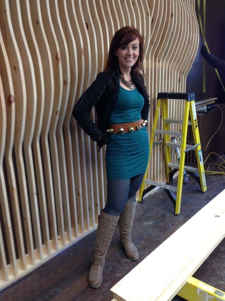
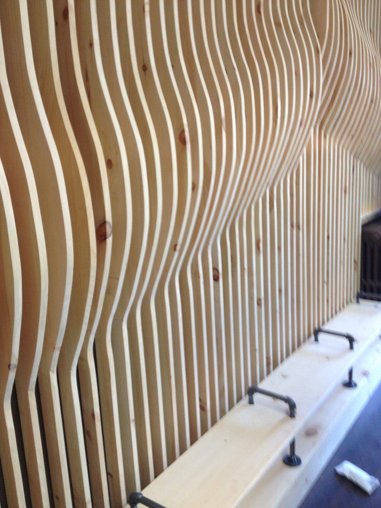
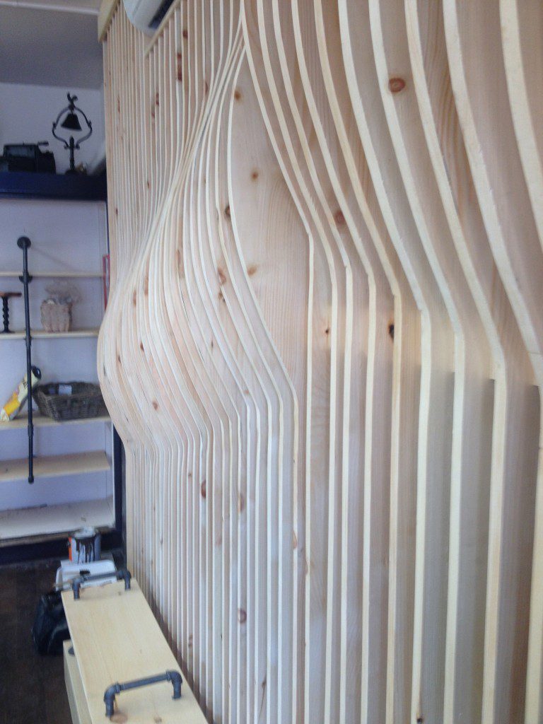
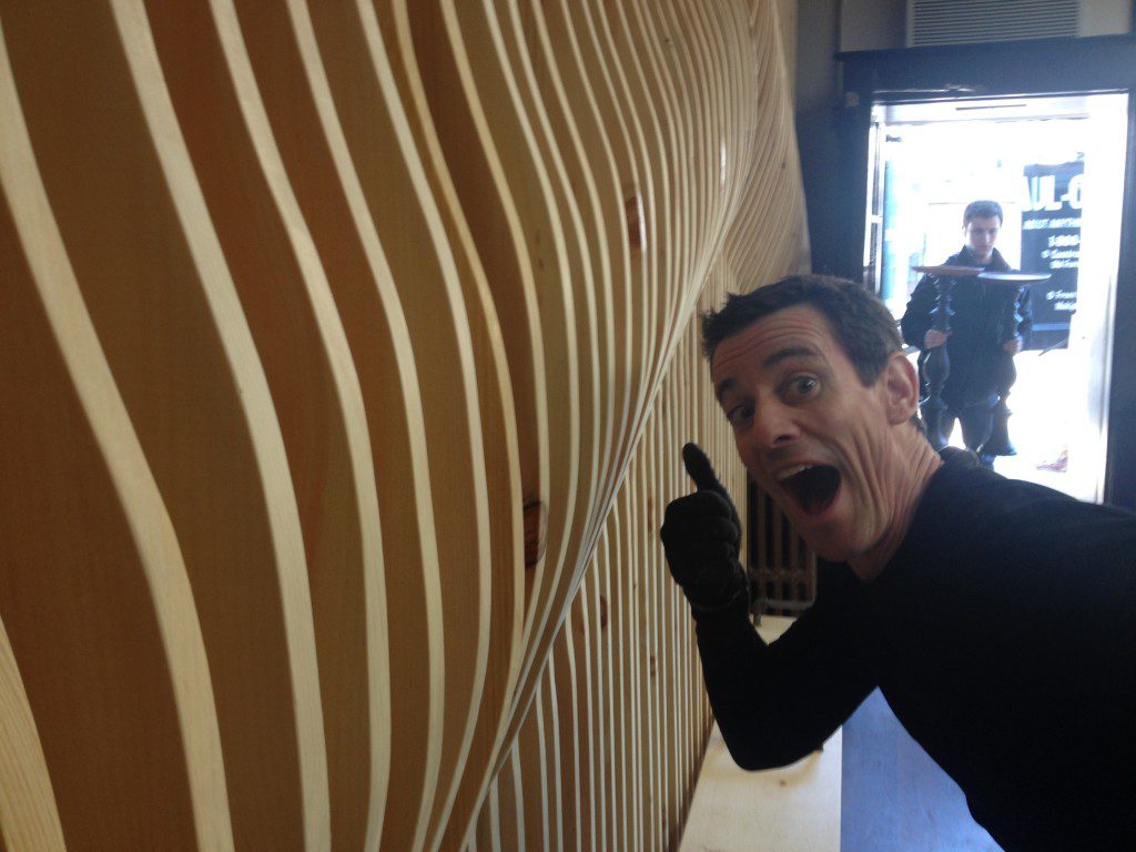
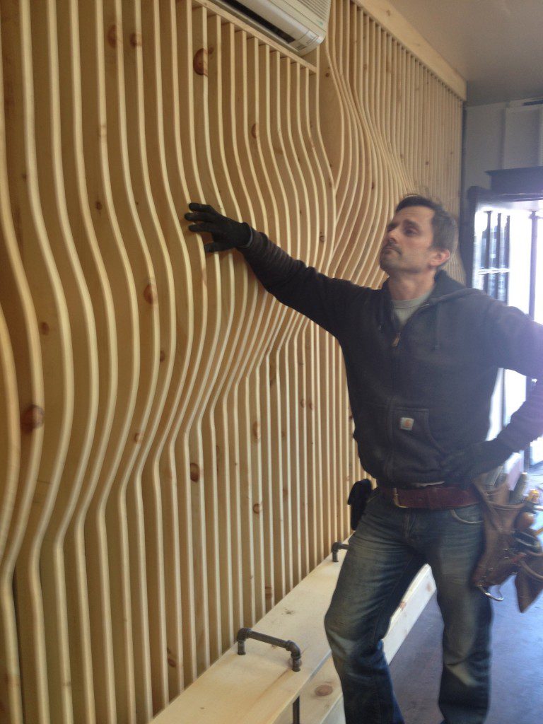
Then to create a meditative environment, I felt that it was essential to bring in natural wood. But not just build wood shelves or do traditional paneling. I wanted to create an undulating wall that has visual movement and texture. To me, the undulating wall represented the two strong-willed men who lead the business. And I hoped the meditative undulating wall would help give them and their customers a moment of calm during very hectic and stressful days.
Since the bakery is extremely small, I wanted to help create a sense of expansiveness within the space. In order to do this, I chose a new dark planked flooring from Lumber Liquidators, and continued the color with a dark brown called Sable from Sherwin-Williams on the wall behind the undulating pine boards (66 in all. Don’t ask our lead shop carpenter about this. He’s still trying to forget. 🙂 )
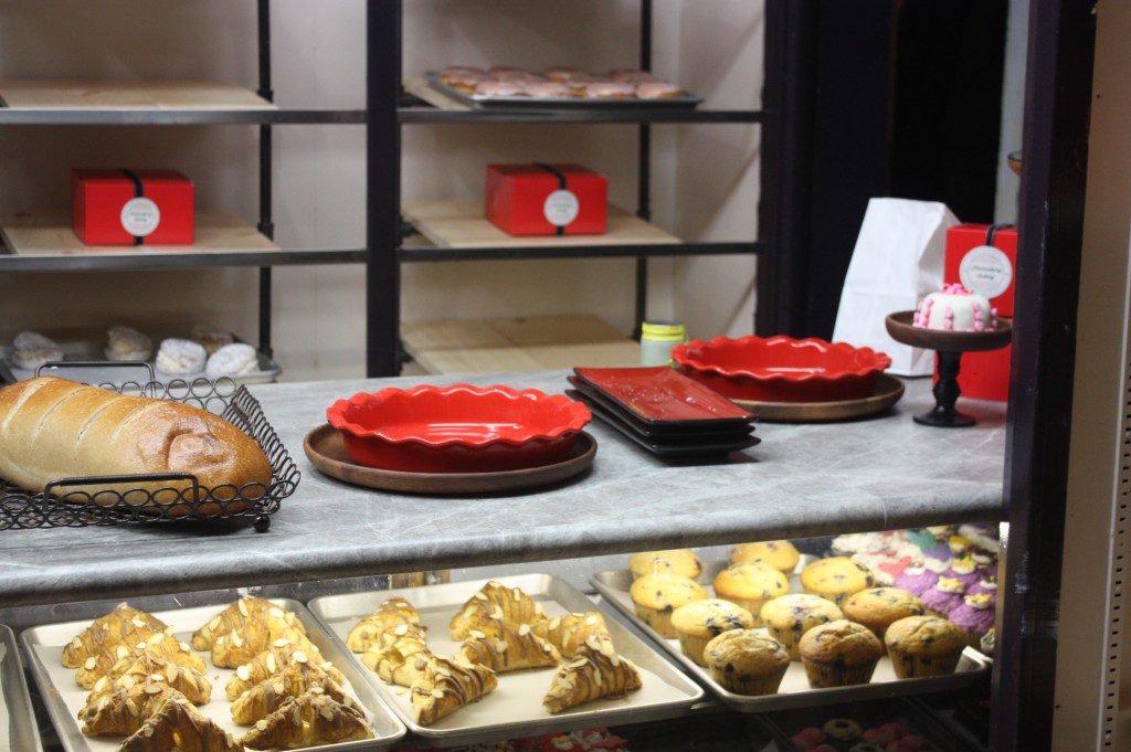
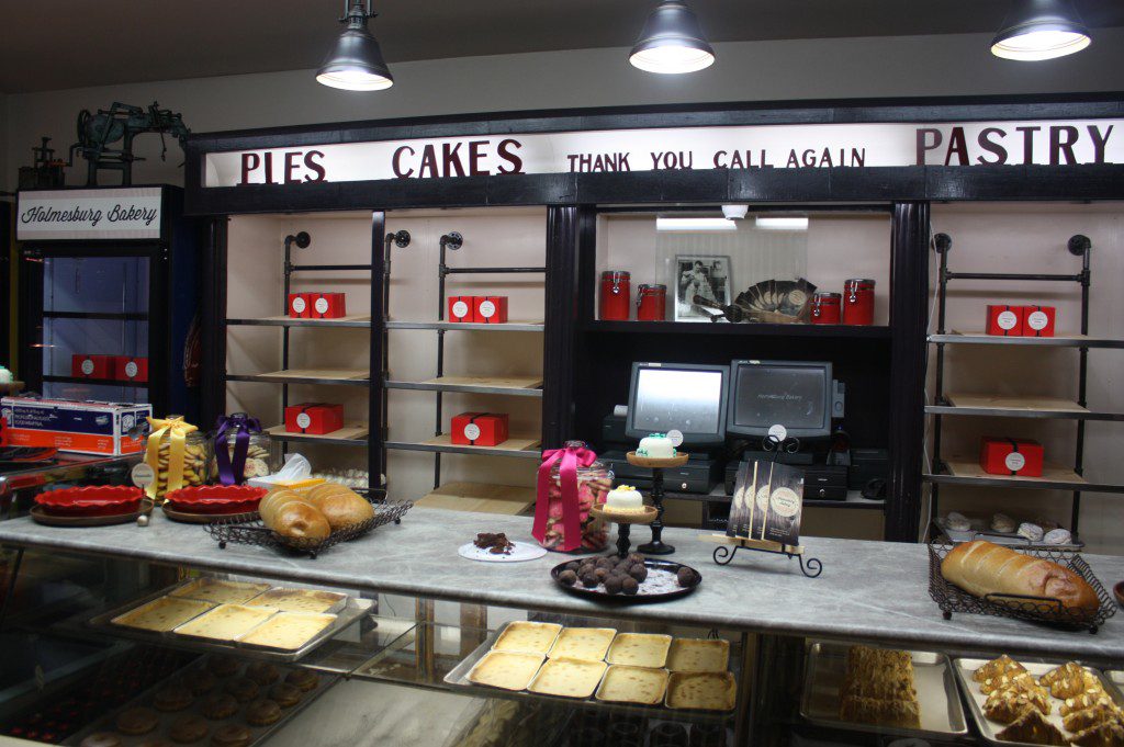
We were able to add a new cold case to the bakery, which was on the top of the owner’s wish list (since their old refrigerator broke). After rearranging the cases, we added a Soapstone Sequoia Formica Corporation countertop. It’s part of Formica’s 180fx collection and has their IdealEdge, so there are no brown lines. Perfect for a meditative space.
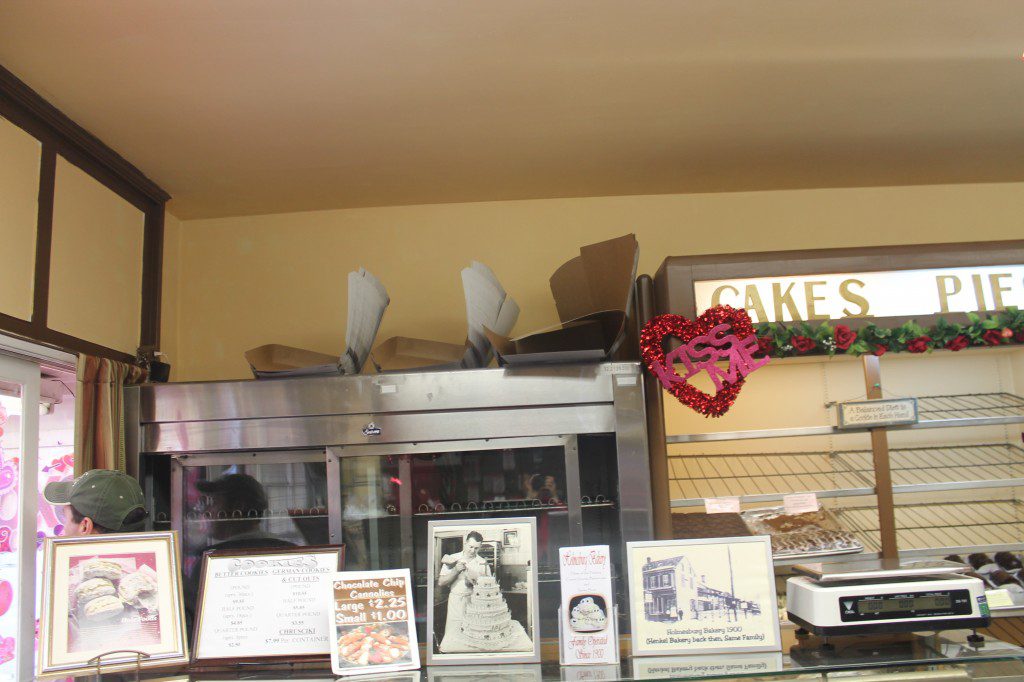
I thought that bringing the industrial steampunk look into the space was a perfect vibe for the neighborhood and captured the edgy-trendy feeling I got from the son, and nodded to an historical element of the father. Looking around the space there were many antique pieces and a few old family bakery photos displayed, but not as front-and-center pieces. They were hidden among the decor. I wanted to make them featured in the space.
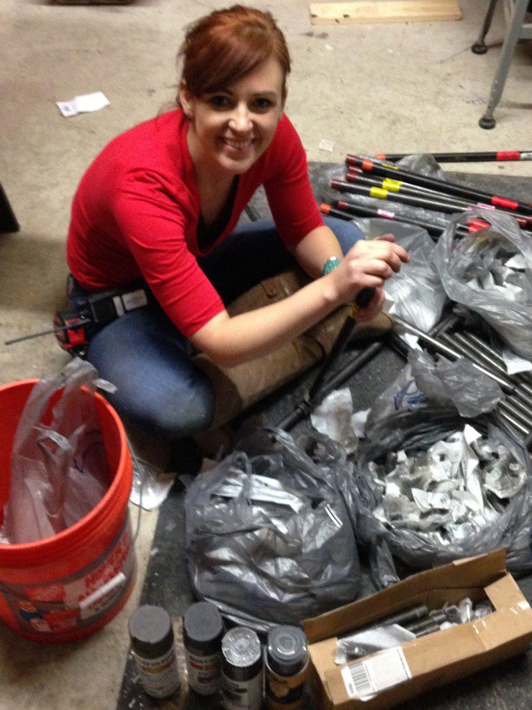
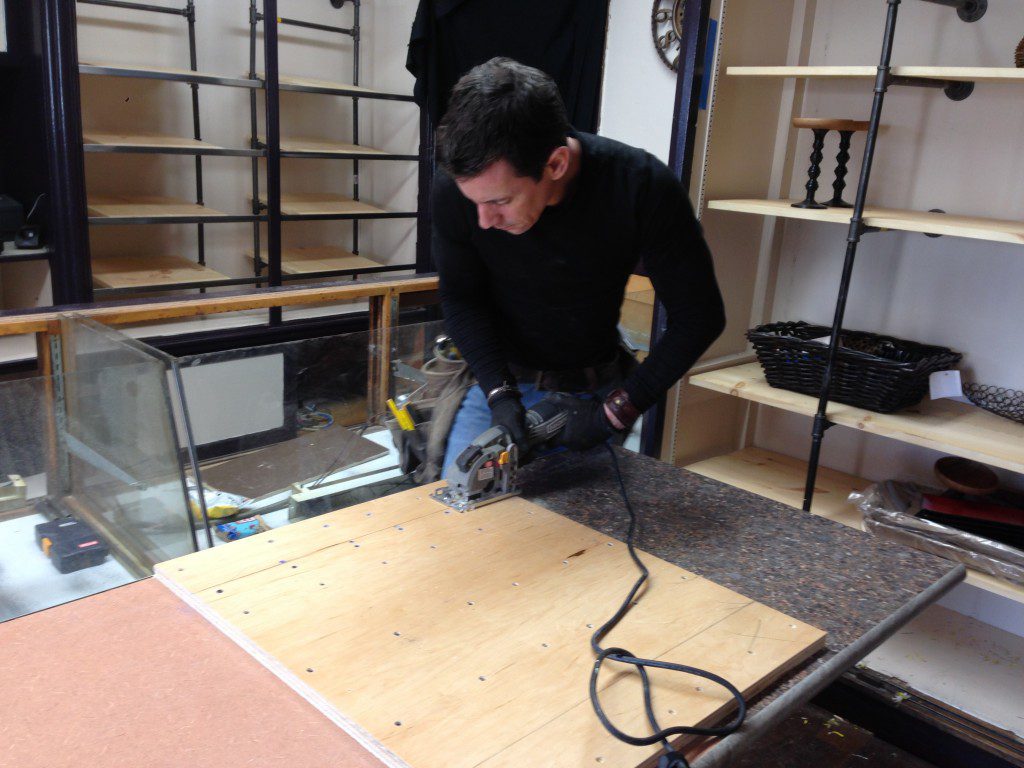
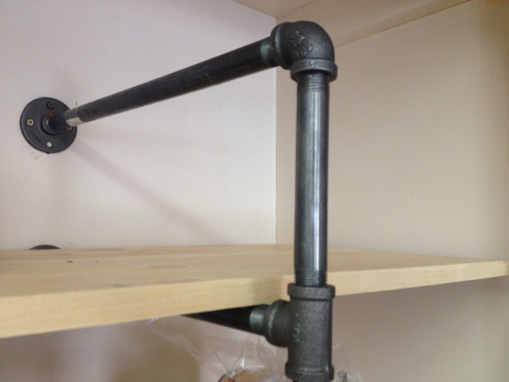
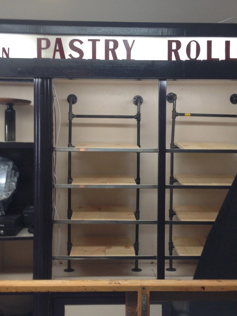
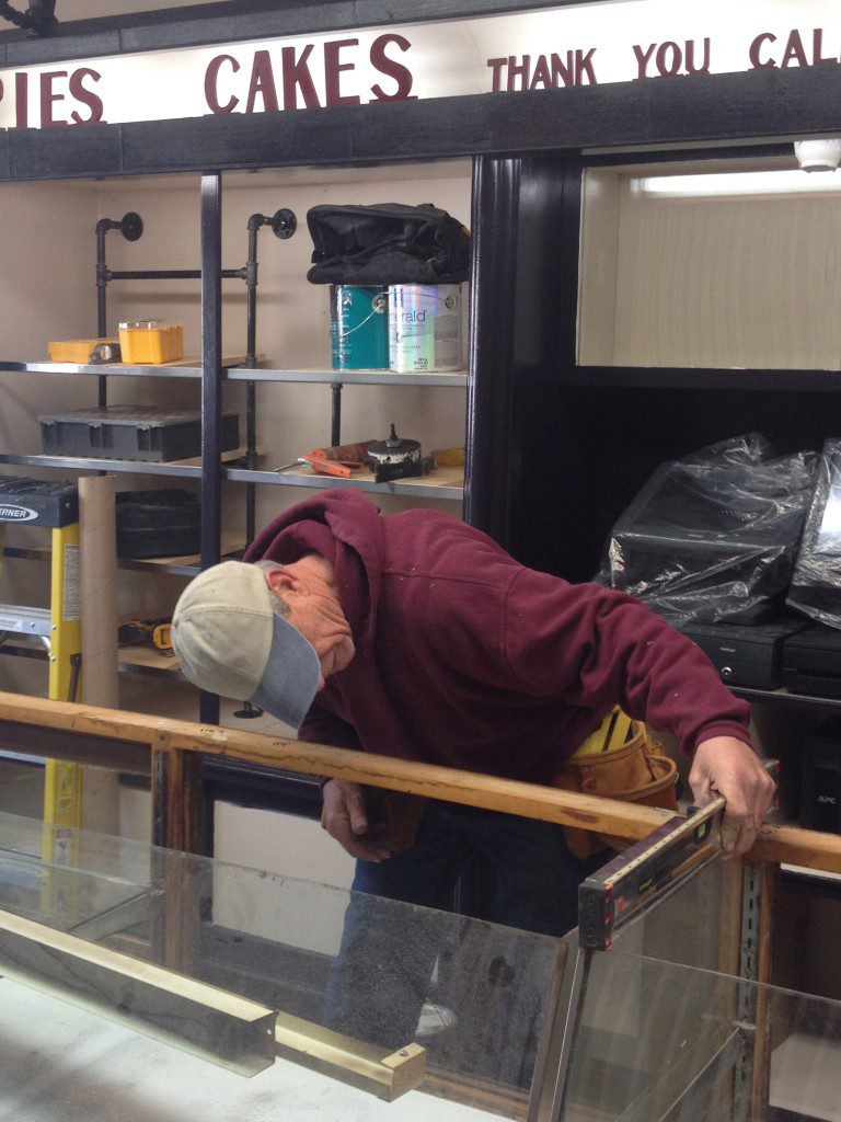
One of my favorite projects I got to create for ‘Save My Bakery‘ was the steampunk shelving at Holmesburg. I fitted black gas pipe together as the supports for pine boards in all of the old shelving frames. Like many of the projects we create, gloves are essential for working with black pipe.
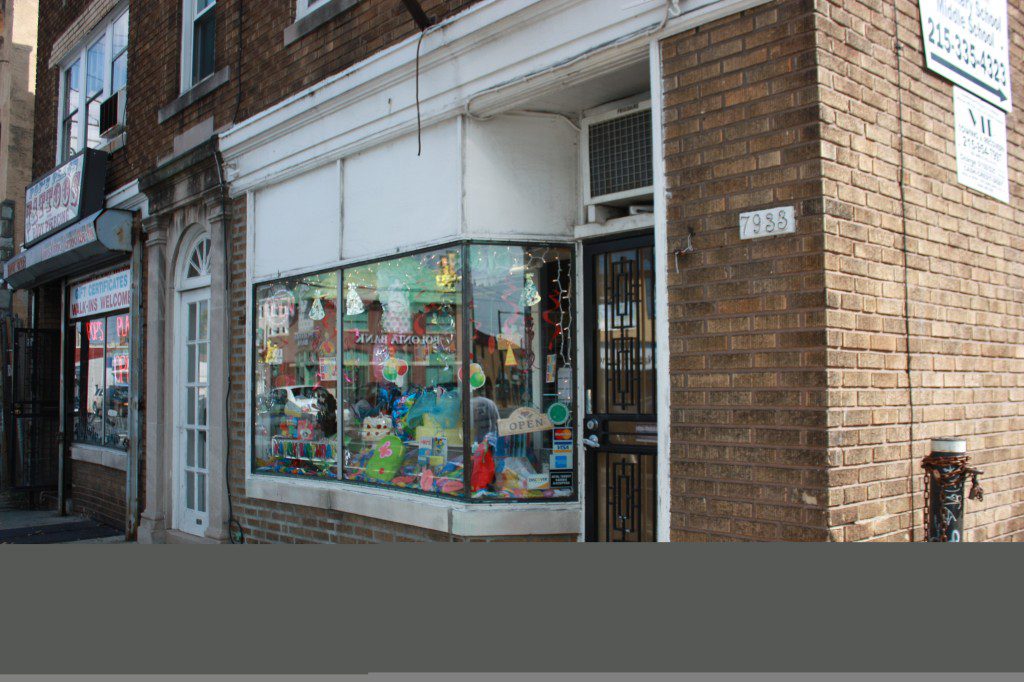
The other major design challenge was the exterior of the small bakery. Their large sign is hidden along the street and tucked behind electrical wires. I would have spent our entire budget just replacing that sign, so we had to create an exterior makeover that would ‘go’ with that pre-existing sign. So I tied in the red from the sign for the new logo, decor, and boxes. There was another sign on the side of the building, which was made from plywood. It was deteriorating and deteriorated. It needed to be replaced. We replaced the sign on the side with a new aluminum sign that will better brave the elements.
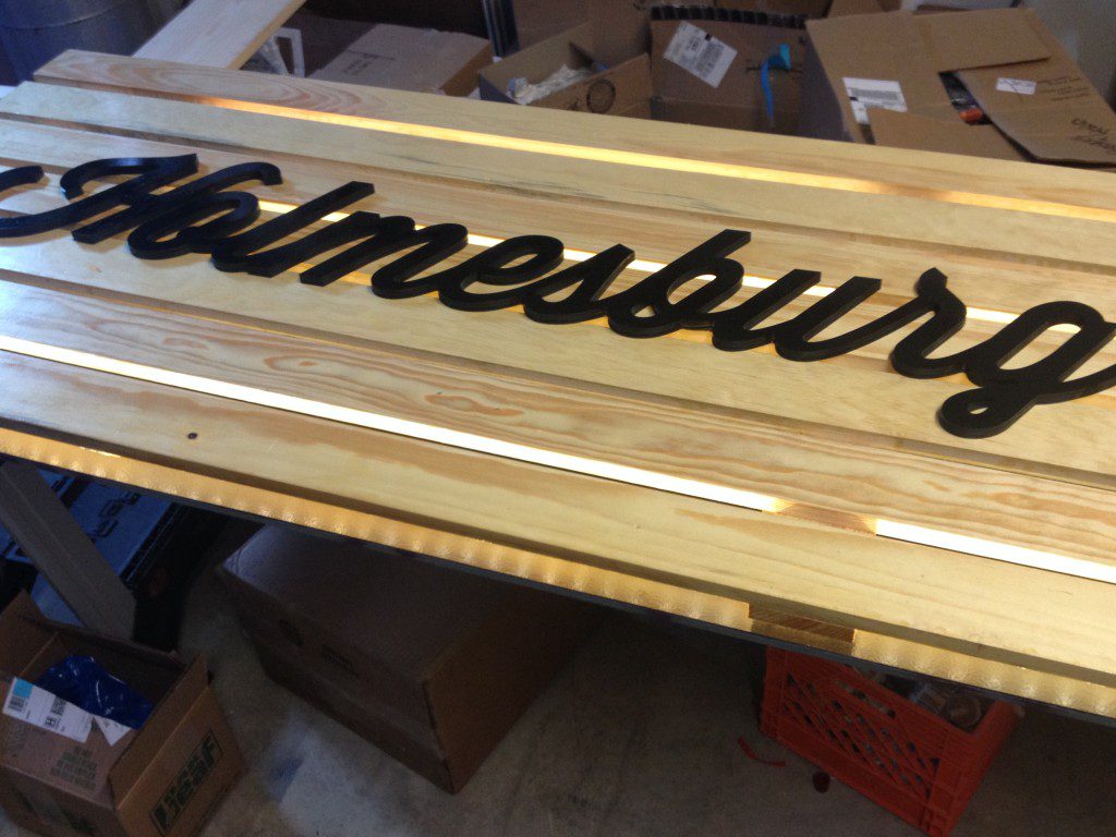
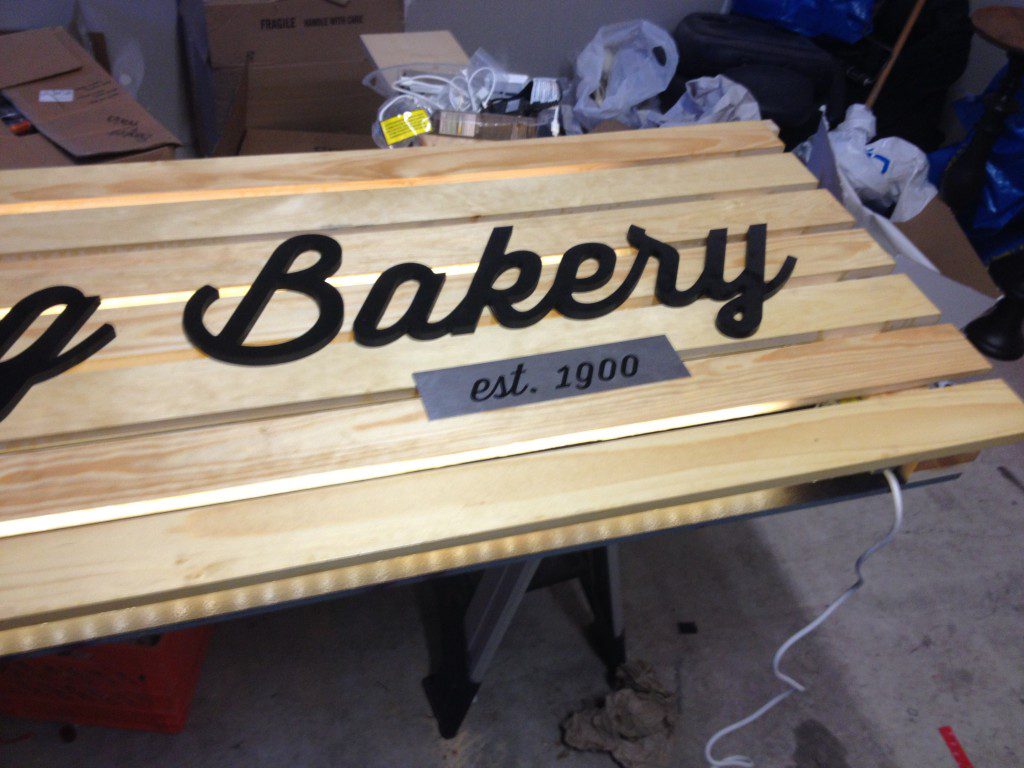
And for the front of the building, we used pine on edge spaced so that light could come through. Black letters in a new font called Hand Shop, with a little aluminum decal that has the year they were established: 1900. We painted the trim and shelving in Bohemian Black from Sherwin-Williams, both inside and out.
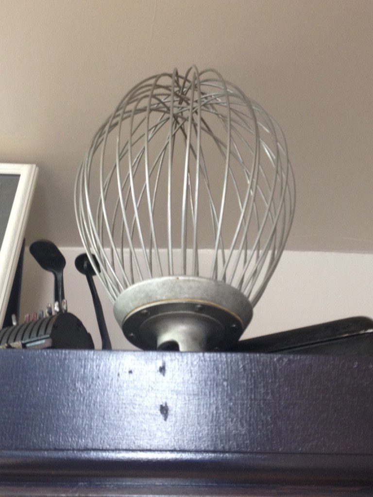
My favorite project of the makeover was creating the egg beater art for the front window. I used three old, large egg beaters and black pipe to create what I hope is an eye-catching window display.
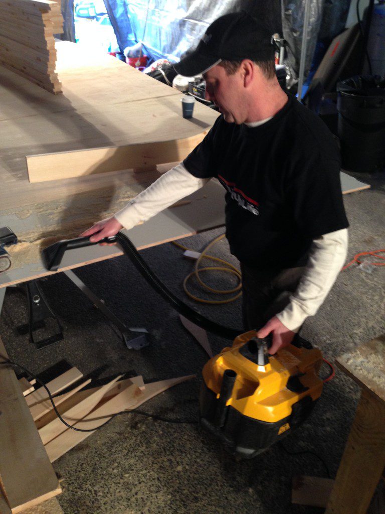
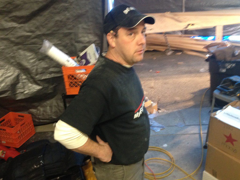
But my favorite part of the makeover for Holmesburg Bakery was that both the father and son loved what we created for them. Hi-5s all around to our team of hardworking carpenters: Mark, Andy, Matthias, and Tom. Kind of amazing craftsmanship and hard work in a ridiculously short period of time.












































[…] seen it lumber yards around the country working on Extreme Makeover: Home Edition and Save My Bakery and at the LBM Ideas […]