The color of the year is way more than just a marketing tool.

Every year, there’s a big fuss when the Pantone Color of the Year is announced. It’s big news for designers, and it’s become so hyped that major news outlets cover it immediately.
Wait, how is a color news?
Yes, essentially, it’s just a color. But, it’s more than just a hue. It’s a statement and reflection on the mood of the world. It represents all of us.
Stay with me.
The color of the year doesn’t start out as a way to sell us more ‘stuff.’ It ends up being used as a way to attract us to new clothes, jewelry, shoes, pillows, and everything else that companies can promote as being ‘on trend.’ It’s sort of like Christmas. The intention of the religious holiday didn’t begin as a way to sell us wrapping paper and fruit cake. Our consumer culture turned Christmas into a season of buying. Our consumer culture turns everything into a reason to buy something.
Color aficionados (aka major color geeks like me) keep an eye on colors that are rising in popularity. Color choices come and go in fashion and home decor. Remember when everyone was using dark green and burgundy together? It was everywhere. And turquoise and green became happy little color cohorts several years ago. Jewel tones have had their major moment that hasn’t quite faded. Light pink and baby blue were on trend for a while. Why? The companies that make the products aren’t the only ones involved in selecting popular colors. It’s about you.
You impact the color of the year.
Color analysts look at what you are wearing, buying, pinning, sharing, posting, and saying about those colors. When color experts get together to talk about color trends, we aren’t talking about selling anything. We talk about what’s happening in politics, environment, science, and the general mood of the country and the world. And colors are a physical representation of feelings.
There are colors that we turn to when we want comfort, colors that we choose when we are hopeful, colors that energize us, and colors that we choose when it’s raining. Look around you on a rainy day, and see how many more people are wearing blue. True story. (Fish sales also go up on rainy days, too.)
There’s a meaning behind the color
Pantone’s color of the year 2020 is Classic Blue 19-4052. It’s a color that is reliable, confident, calm, and stable. With the mood of our country, and the uncertainty of what will happen next in politics and with the environment, we need more calm. We need stability, less tension, less stress, less conflict. We need more of what Classic Blue offers.
So no, Pantone’s Color of the Year Classic Blue isn’t just a marketing tool for companies to sell us more ‘Classic Blue’ colored items. Yes, the color does increase the production and sales of the color, but it isn’t really what is at the heart of a ‘color of the year’ pick.
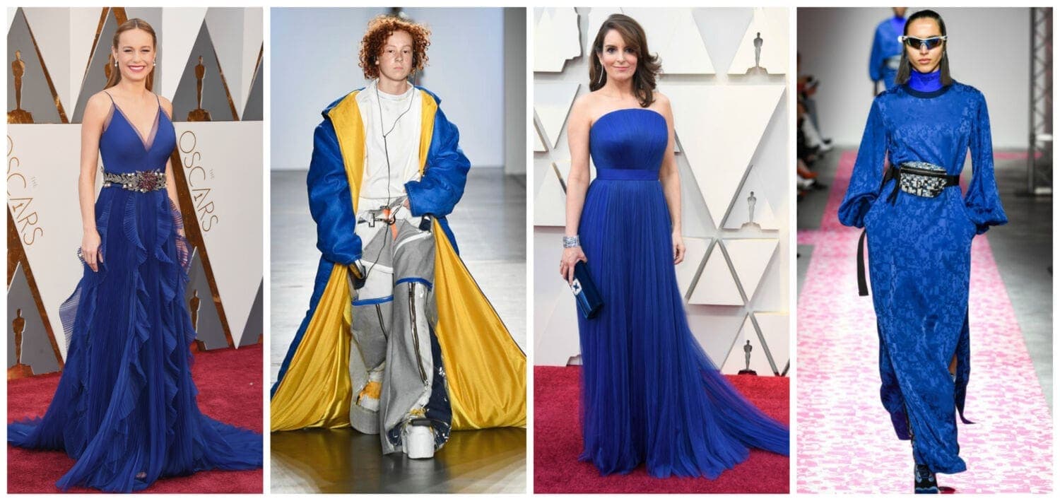
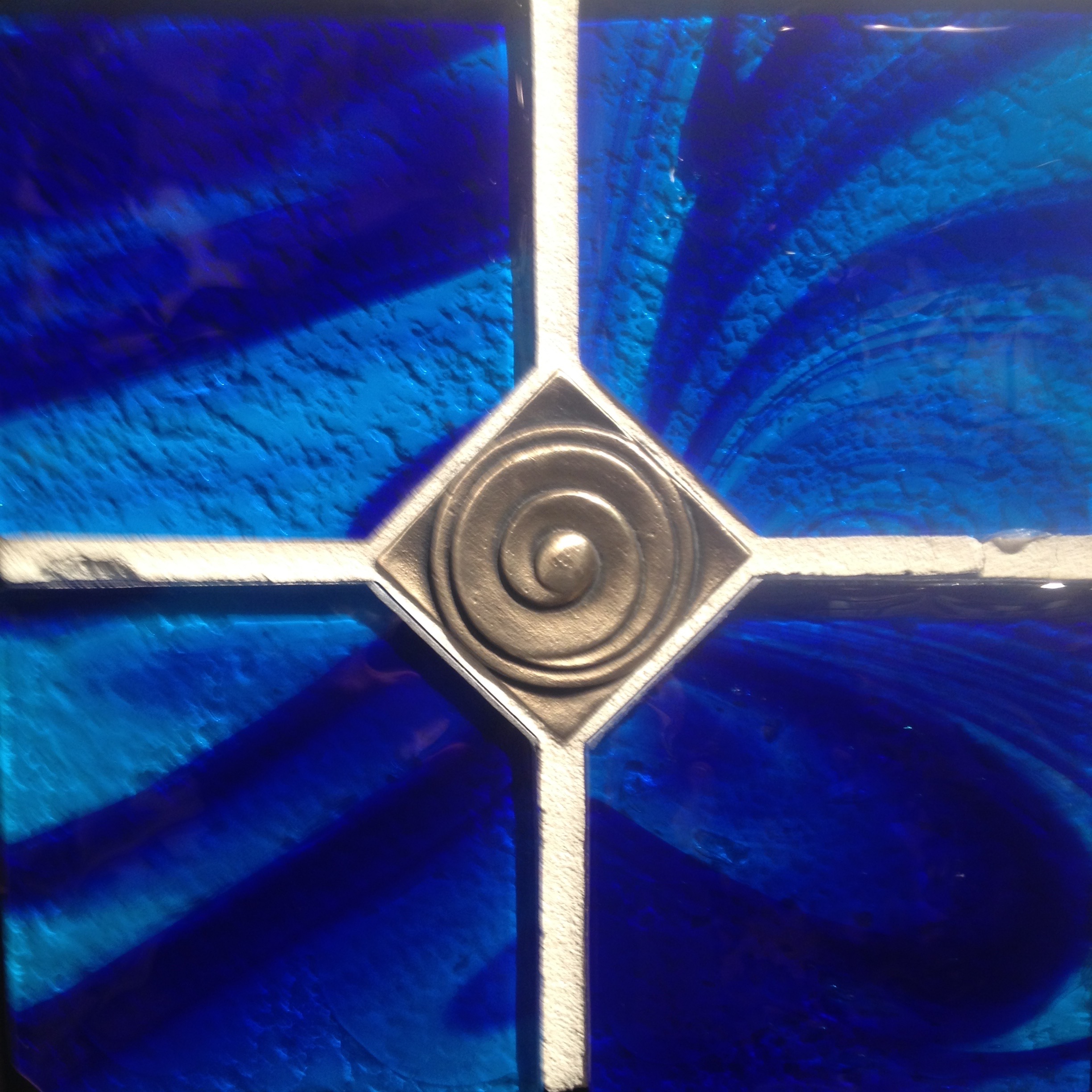
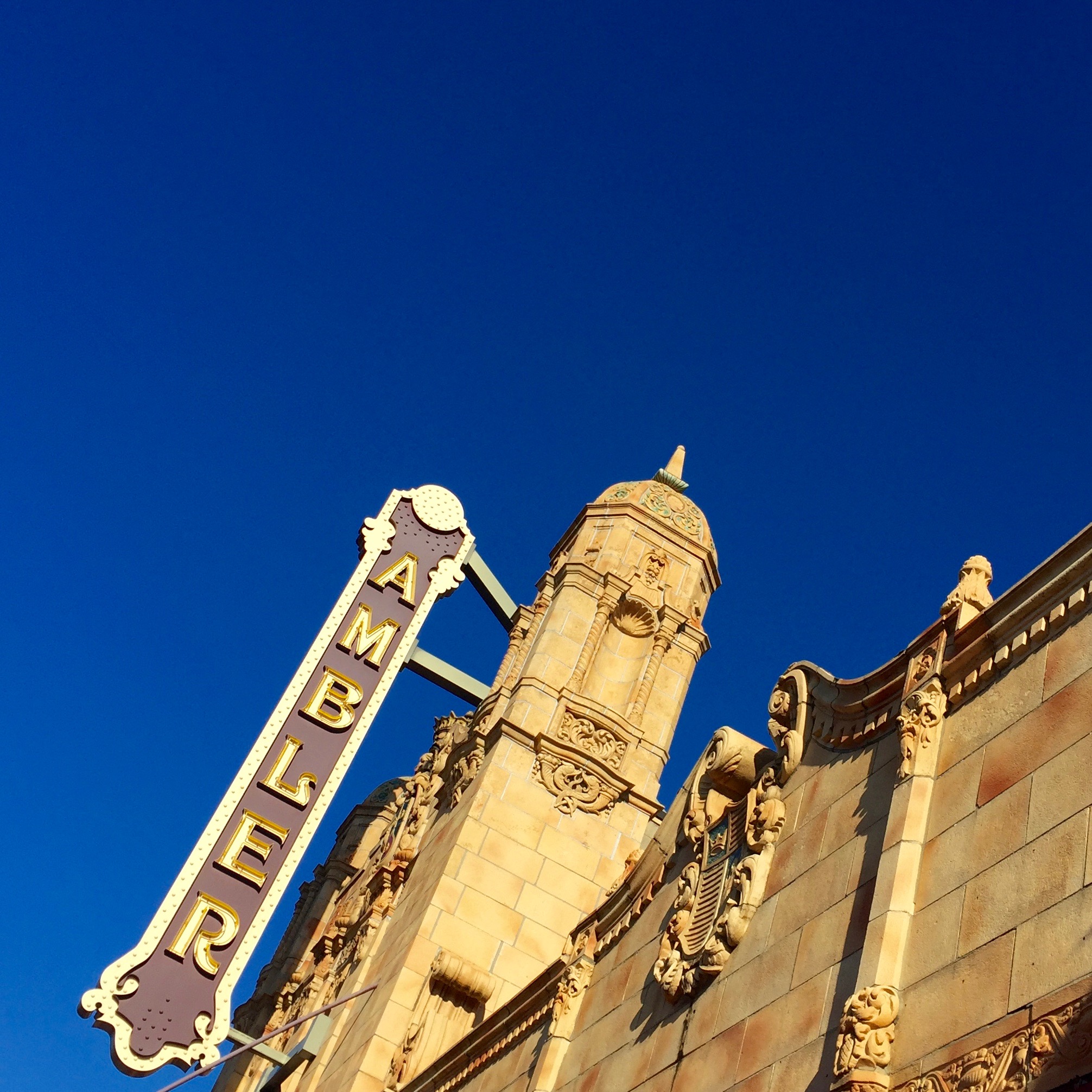
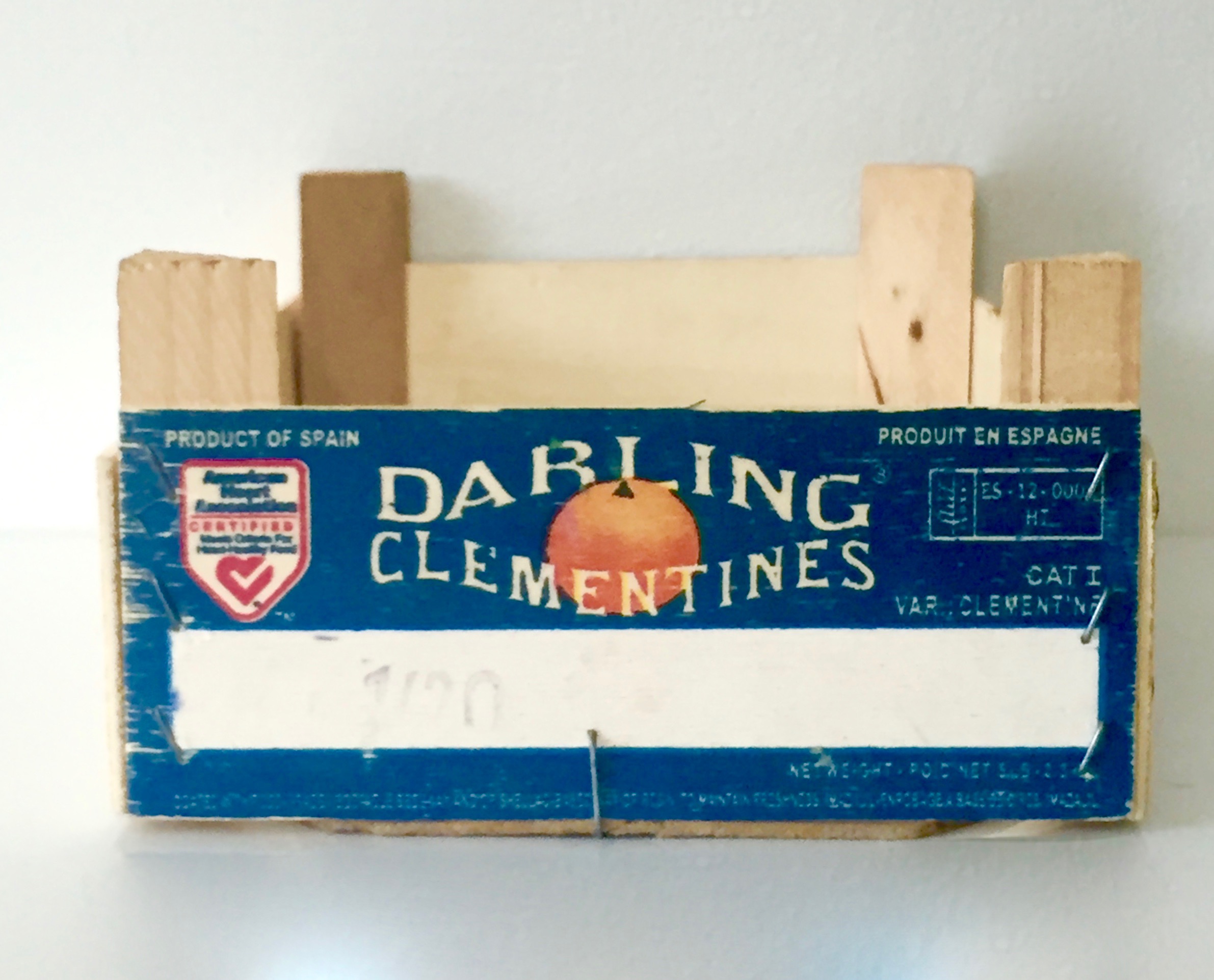
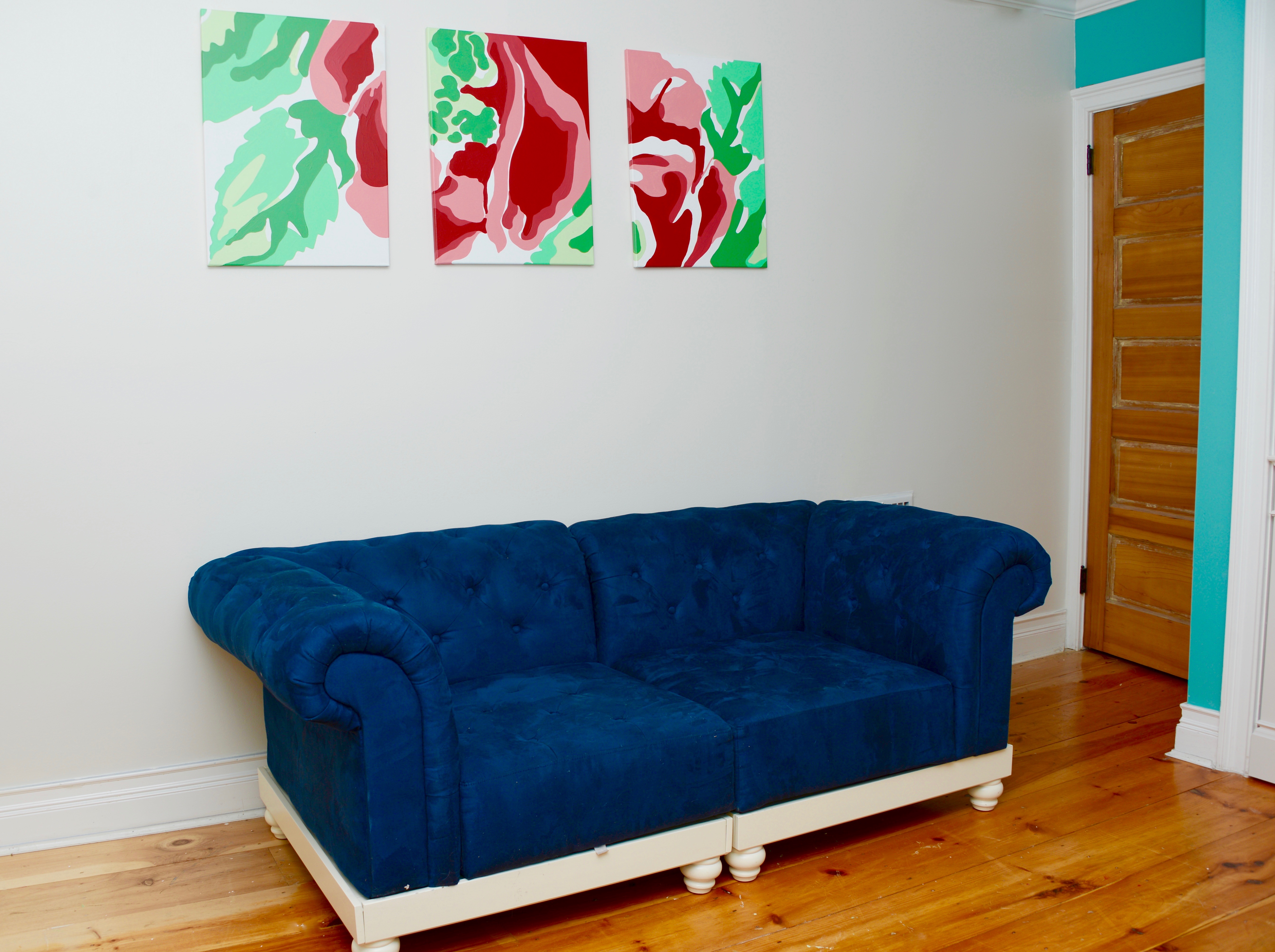
I’ve been noticing more of this blue hue on the runways and red carpets this past year. From signage to tile to furnishings to home decor to clothing, it’s become more noticeable to me lately. It’s a color that I’ve been wearing more and using more in home designs, and so I’ve been collecting blue images in an album on my phone. Below are some of the Classic Blue images that I’ve curated during the past year.
Oh, and I hope you’ll keep in mind that when you see more shops stocking Classic Blue, it’s partly because they know it is the chosen color, and partly because you helped choose it.
