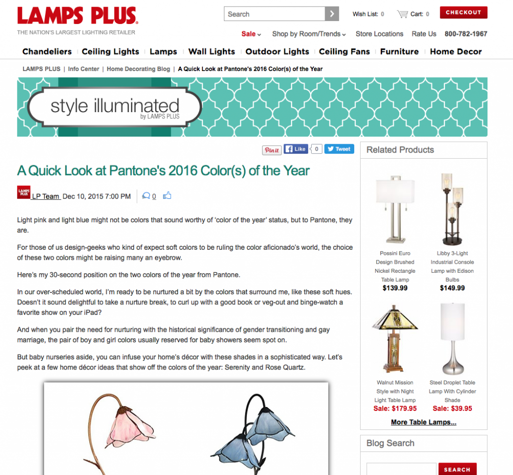
Trends and the colors of the year are always fun to play with, especially in accents and little decor at home.
Pink and blue sound like they belong better in a nursery than in any other room. But, that’s not exclusively true.
If you’ve grown out of your Barbie doll phase, you might wonder how Pantone could have possibly selected two such passively childish colors as the 2016 colors of the year.
Well, yes, our nurture informs our innate reaction to color. When we see green and red, we think Christmas. When we see a pastel assortment, hello Easter bunny. And green is St. Patrick’s Day. Red-white-and-blue to Americans makes us have an urge to see fireworks.
So yes, the quiet hues that Pantone selected called Serenity and Rose Quartz might seem unsophisticated at first, but look at them separately with other things, before you judge. Then look at them together again.
The soft shade of blue called Serenity is calm, peaceful, soothing. It’s exactly what we need in our frenzied do-10-things-at-once culture. Let’s jump under a Serenity blue throw and drink a mug of cocoa with our loved ones.
The soft shade of pink called Rose Quartz sound more elegant, and really is more elegant than the pastel baby pink we instinctively associate with a newborn girl. It’s a bit crisper and looks smart with black, navy, or metallics.
I’ve looked through the options available in home decor on LampsPlus.com, and discovered a few that might be easy to incorporate into any non-Barbie-dream-home home.
Click here to read more by Theresa on LampsPlus.com


