We learned a new word during the Nazareth, PA, ‘Save My Bakery’ makeover for Food Network: Faschtnacht.
It took about an hour of walking around and talking with the owner of Schubert’s Bakery before I had a sense for what he wanted from the design makeover. And even though Steve was misty-eyed and grateful after the reveal, he still wasn’t able to exactly articulate what it was that he wanted. But he knew he had it.
The owner wanted his bakery to be warm, inviting, comfortable. He didn’t want a bakery that was modern or matchy-matchy. Also, he likes to banter with his employees and customers.
He likes working in a small town, knowing everyone on his street, and knowing that everyone in Nazareth seems to have a genuine kindness for everyone else. What he couldn’t quite say, but that he was describing was that nostalgic feel of a small town bakery from a century ago.
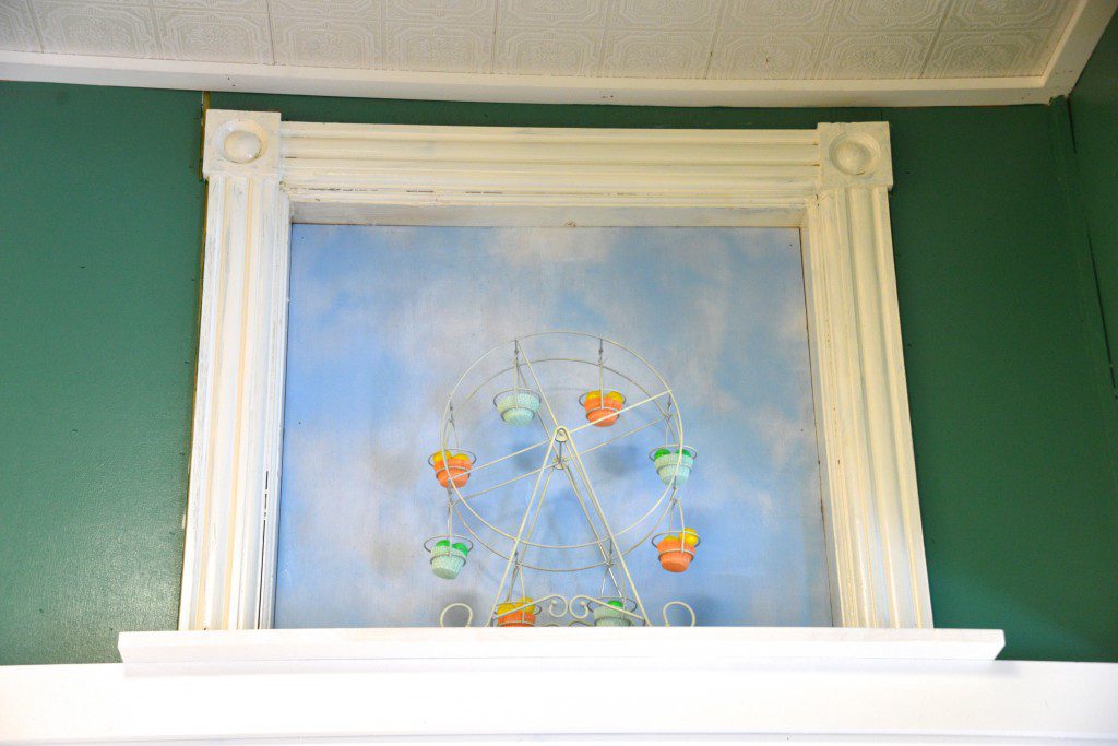
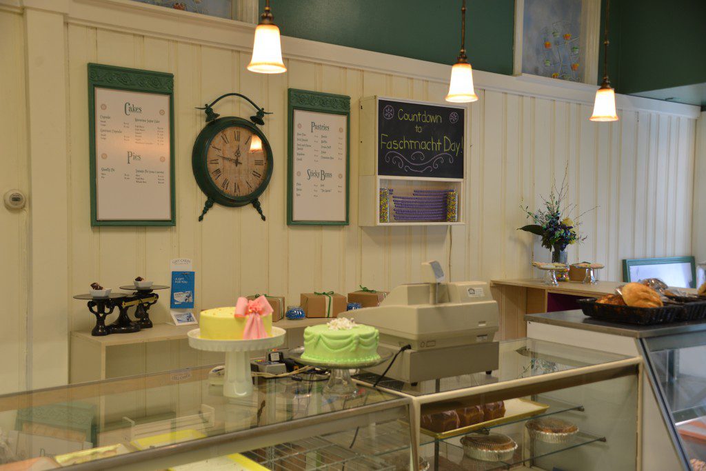
The goal was to use color, material and decor to create a more open, airier space. And bring in elements like the vintage-looking pendants and the Ferris wheels in the new faux windows that gave a nod to the romantic view of a century ago.
Design makeover details:
Color
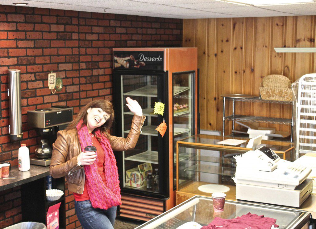
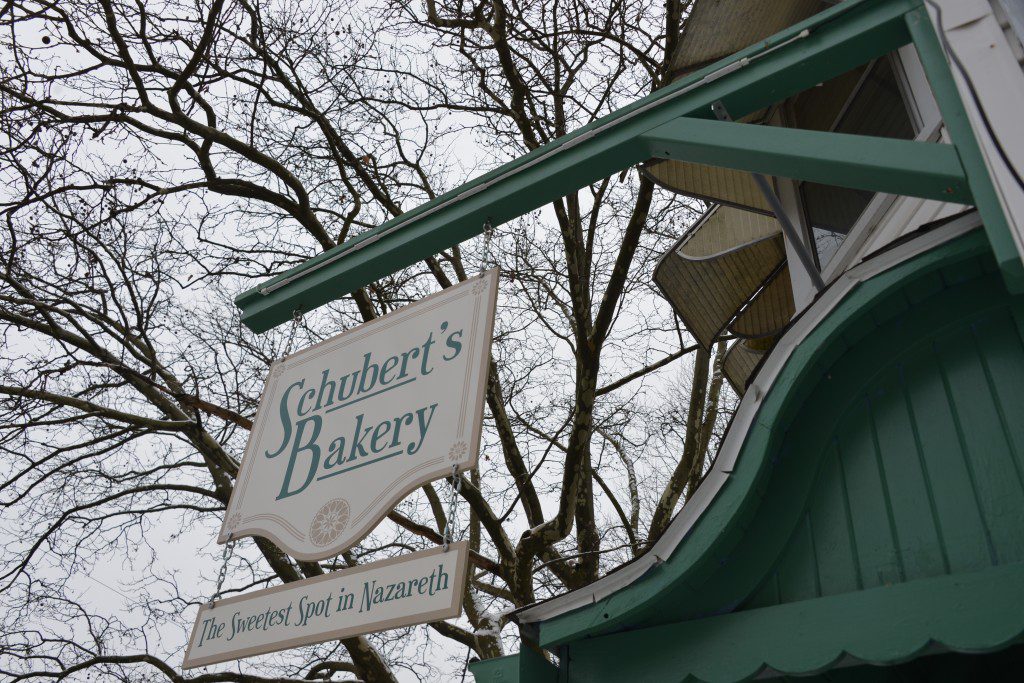
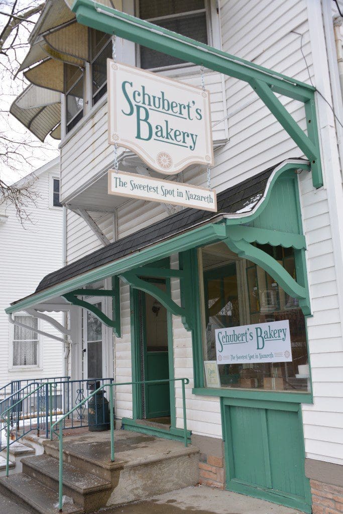
The before color palette of dark wood and burgundy made the space feel more like a bowling alley than bakery. So I chose Sherwin-Williams Paperwhite cream, Nantucket Dune, and a warm green called Jadite. On the exterior, we painted the blue trim in the new green.
Floorplan
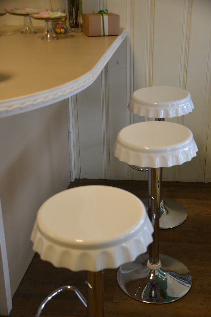
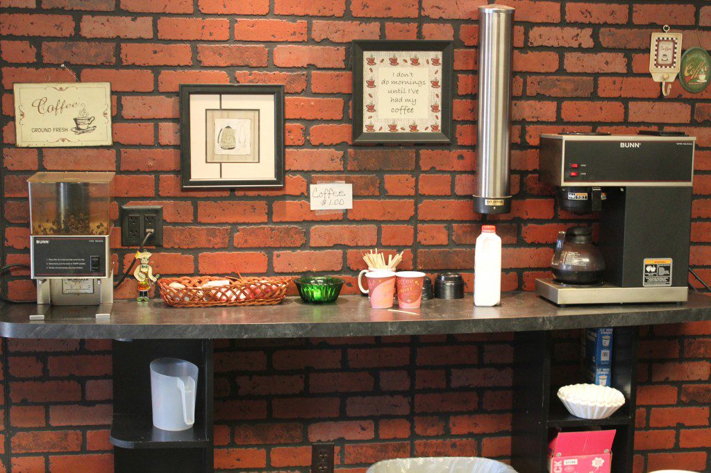
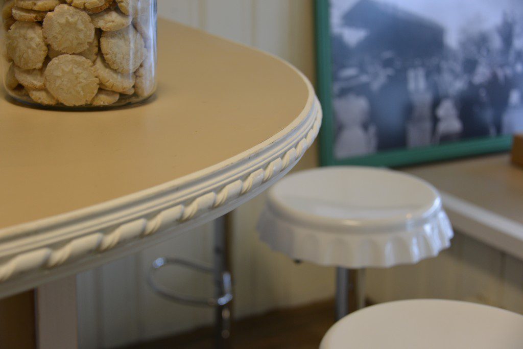
I changed the layout of the bakery cases to open up the space to create more room for the customers. We removed the drink case that was only there for storing cakes, removed the old shelving from behind the counter and coffee bar area, and removed the case that no longer had glass on the customer side. Then, we added a new bar-height counter with retro-looking stools and added a new cold case. Plus, we added a new, sturdier shelf behind the counter for coffee.
Lighting
One of my favorite ways to change the look of a space is through lighting. The type of light and light fixture can completely change a mood. For this bakery makeover, I chose mini pendants from the Murray Feiss Celine Collection at LampsPlus. The bring a touch of the old world design with the bronze finish and hand-blown art glass.
Flooring
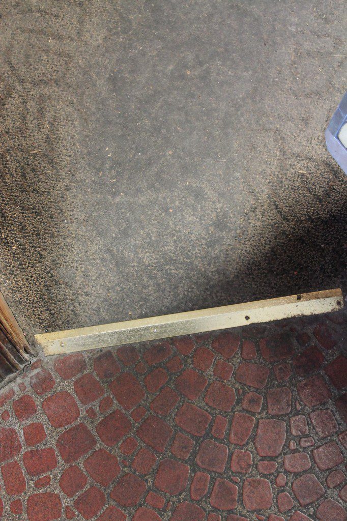
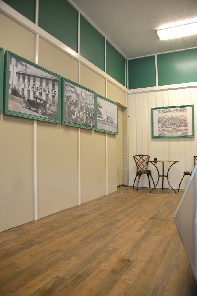
The biggest complaint at every bakery I’ve designed is the flooring. And this flooring was in need of an update. The carpet was disintegrating, and the vinyl was not doing much better. We removed the carpet and replaced it with a new aged wood-look from Lumber Liquidators.
Lauan Plywood Wall
Mark used his now-famous lauan plywood trick to quickly makeover the longest wall of the bakery. Using sheets of plywood to cover the wall, and then implementing the theory of board-and-batten, he covered the seams with strips. It might be best suited for a rustic or minimalist style unpainted, but painted, the luaun plywood transforms into a classic look.
Feature Art
A favorite way to create a vintage theme is through art, so I wanted to give Schubert’s a collection of large-scale historic photographs to celebrate the town’s unique history. Unfortunately, the local librarian does not have a collection of historic photographs. With a lot of sleuthing, I found the town’s photographic historian, Darrell Mengel. He has an extensive collection of photographs depicting all of the town’s transformations and celebrations. We framed each photo in custom-made frames.
Display Window
The front window had a decal and a wire-framed shelf and not much product on it. We created a more organized and intentional-looking window display by replacing the decal in the window, removing the wire shelf, and creating a series of custom display boxes that are attached to the ceiling by spindles.
Fun touches
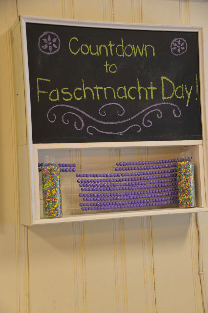
Schubert’s Bakery celebrates the Pennsylvania Dutch Faschtnacht Day every year. It’s the bakery’s busiest day every year. I couldn’t resist including part of the Penn Dutch culture and fun into the design. So, I used some of the Penn Dutch Hex symbols in the new sign and logo that mean good luck, and we created the first-ever (I think), Faschtnacht Day countdown board.
I don’t think a Faschtnacht Day will ever pass by without thinking about Steve and Schubert’s Bakery. I hope you’ll check out more of our design makeovers for ‘Save My Bakery‘ on Food Network.
