18 of the 20 most popular kitchens on Houzz aren’t designed for Alzheimer’s

2016_designallz_houzz_kitchen_myfixituplife- Alzheimer's

Kitchen design for Alzheimer’s

‣ MyFixitUpLife 2016_designallz_houzz_kitchen_myfixituplife- Alzheimer's
Why wouldn’t this kitchen design work for Alzheimer’s? While the natural textures and daylight are important in an Alzheimer’s home, there is too much visual stimulation. An Alzheimer’s brain would not be able to process all of the visual information, and it could stop the person from making any decision to move or not to move in any direction. Simplicity is key when designing for Alzheimer’s.
It’s a luxury, taking a break to fantasize about the gorgeous designs on Houzz. I love the textures, colors, and the ingenious uses of space showcased by the most talented designers in residential construction.

But, those designs aren’t exactly the best ‘design prescription’ for a family living with Alzheimer’s.

Of the top 20 most popular kitchens on Houzz, there are just 2 that would actually help best serve someone living with dementia.

The reason? Alzheimer’s affects the way a brain processes information.

If there’s too many things on a counter, if there are patterns, if there is high-shine, if there isn’t enough color contrast between items, well… it makes someone with Alzheimer’s frustrated.

And since Alzheimer’s makes it hard to process information, your loved one can’t tell you that it’s hard to see the white sink on the white counter, and since emotion is the strongest remaining part of their being, their anger and sadness can affect everyone in the household. It takes patience and insight to get to the cause of the emotion.

So of the 20 most popular kitchens on Houzz, here are the two that are best suited for an Alzheimer’s family.

‣ MyFixitUpLife 2016_DesignAllz_Houzz_kitchen_MyFixitUpLife 1
Why does this kitchen design work for Alzheimer’s? There is color contrast is mid-tone hues, the design elements are historical and familiar, there is daylighting, the faucet has separate hot and cold, the counter is mostly clutter-free, and the work surfaces are a different color than the surrounding surfaces.
‣ MyFixitUpLife 2016_DesignAllz_Houzz_kitchen_MyFixitUpLife 2
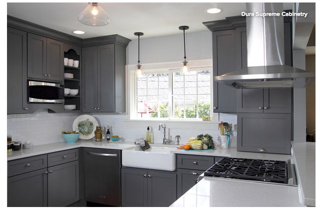
Why does this design work for Alzheimer’s? The grey-and-white color scheme is simple to visually understand. It’s easy to see the sink, there is natural light, one cabinet is open to allow someone with Alzheimer’s to easily see frequently used items, and the counter is mostly clutter-free.
author avatar
MyFixitUpLife
Mark & Theresa created this honest and personal guide about home improvement to share the tips, techniques, and trends that help you make smart decisions about updating and personalizing your home.

Related Posts

Leave a comment

Verified by MonsterInsights