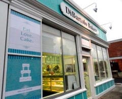
Challenged to makeover a bowling alley-looking bakery (that specializes in wedding cakes) in 48 hours by Food Network and Kerry Vincent, I wanted to create a Tiffany moment for this bakery makeover.

And when the idea of ‘wedding’ is mentioned, the every-girl-fantasy-image is those pretty blue boxes.
So when the Food Network challenged us with a bakery makeover for a business that specializes in wedding cakes, why not change the 1970s unwelcoming ‘bowling alley style’ into a Tiffany moment?
Elegant and inviting, every woman knows that blue-and-white color combo says ‘wedding’ and ‘treat.’
So with white boxes with blue ribbon on the inside and with blue paint and white trim on the outside, we created an abstract Tiffany-esque box filled with treats that even Audrey might dare to peek at.
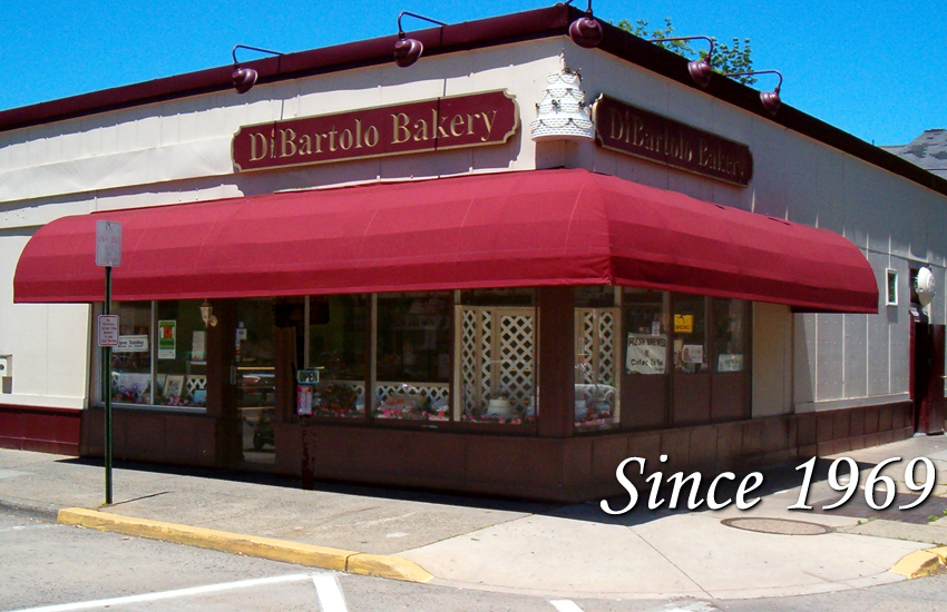
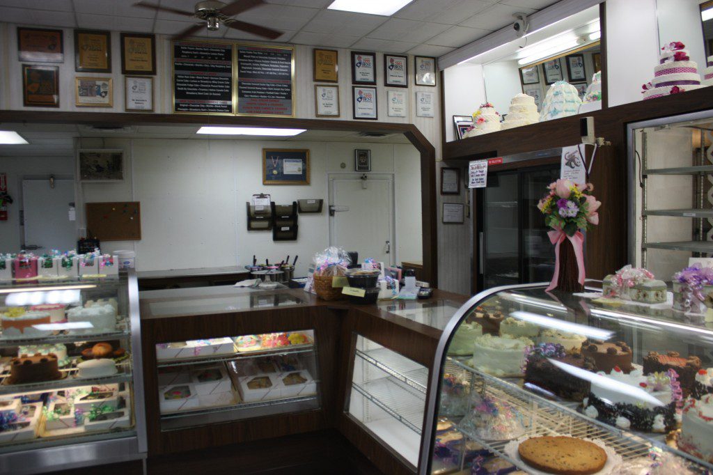
The before. The interior was confusing. The brown laminate and burgundy paint made me feel like I was in someone’s basement from the 1970s. There was stuff everywhere. It was hard to figure out what they were actually selling. If I didn’t know better, I’d think they weren’t quite ready to be open for customers yet.
The aging awning shrinks the grand 8-foot windows. The window lattice acts as another barrier. Combined with window displays that stop the eye from looking (and customers’ feet from walking) into the shop, it gives a closed-off impression. The awning visually separates the shop from the rest of the block, further creating an overall impression of ‘don’t come into my shop.’ It speaks of a family and a business that has internal conflict and has unintentionally outwardly tried to shrink from the outside world, as to protect itself from further possible problems.
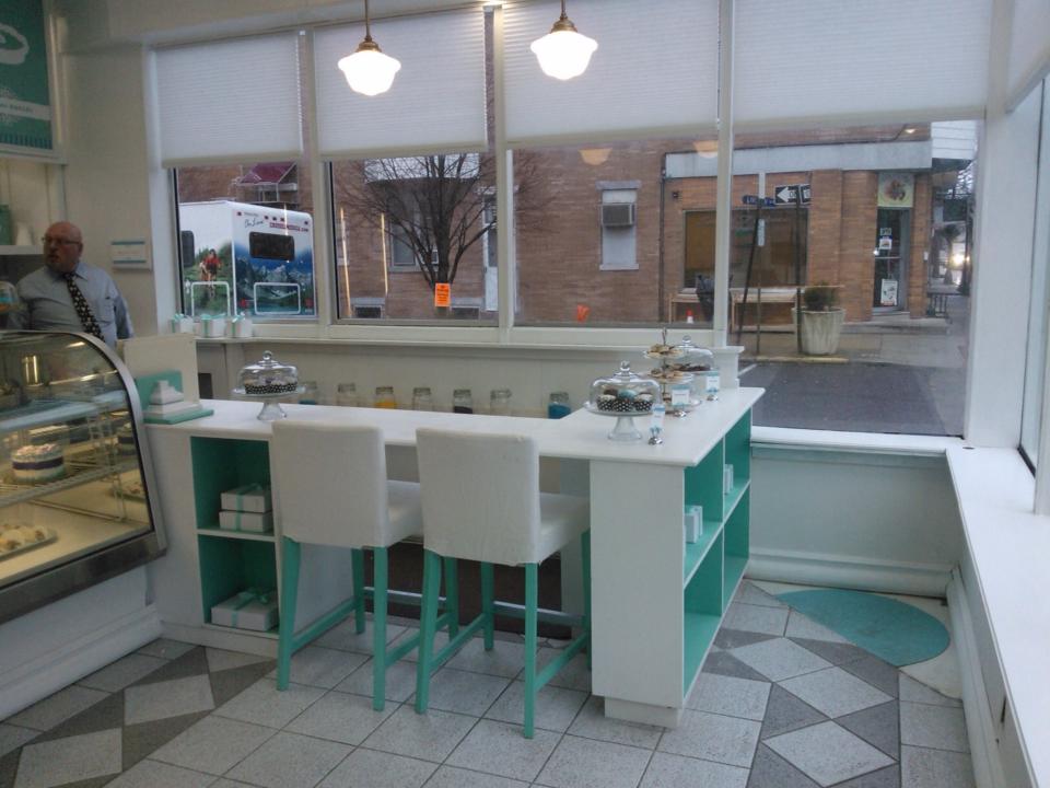
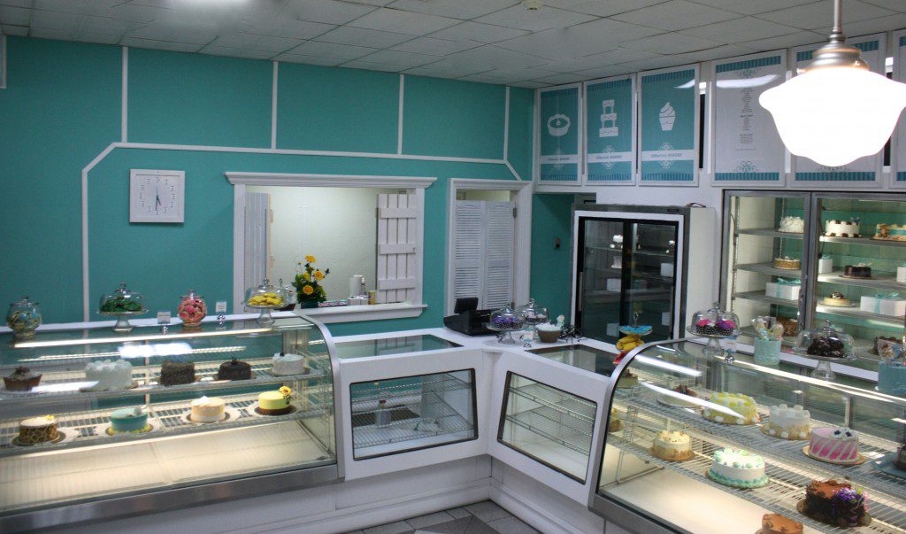
New design scheme. The new design shares a calm, welcoming spirit. Inviting to customers to enter, the comfortably-clean style makes customers feel relaxed and special during their experience at the bakery.
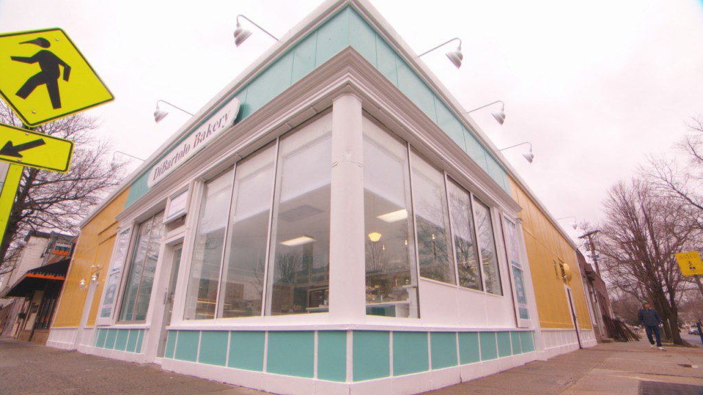
The Tiffany color is proprietary, so we could either go a PMS shade into more blue or tone it down with the other direction into green. I chose the green side of this proprietary color to blend with the historic block, with the Sherwin-Williams Cooled Blue as the main paint color.
The bakery needs to be eye-catching to passersby and drivers, so we updated the signs in the new colors, with bright white molding. We removed the awning to bring light and customers eyes (and then feet) into the shop. We changed the massing of the overall shop by demarcating the corner bakery with one additional ‘faux’ window bay. It has a simple styled graphic and a flat stock column detail on each end balances the corner column that already exist. The additional ‘bay’ is the same size as the window bays.
I created the new slogan ‘Eat. Love. Cake.’ for the bakery makeover and after selecting the colors, fonts, and sketched the new logo, I worked with my graphic designer to make the polished graphics come to life. The font and style created to reflect the Classic Cottage theme, and to appeal to the newly-engaged target market for the bakery.
The finishes are a mix of classic and cottage. I chose a classic 50s style pendant for lighting over the bakery counters. It’s a classic schoolhouse style light that’s perfect to help create the feel of a traditional family business that is also quite on trend for what it currently happening in lighting. The mix of modern and traditional is so important to many brides.
We replaced the lattice behind the refrigerators with blue-washed board-and-batten. And we integrated a new interior window wall (complete with ‘window’ sill, trim and casing) to frame the wedding cake decorating area. The window wall helps mask some day-to-day clutter of an operating bakery too: supplies, deliveries, etc. White-washed board and batten shutters on each side of the opening further evoke the cottage theme.
The bright white Fypon molding with a classic color palette combine to bring the bakery up-to-date, while being reflective of this historic town. I think this bakery makeover fits in with the town and the target client. What do you think?
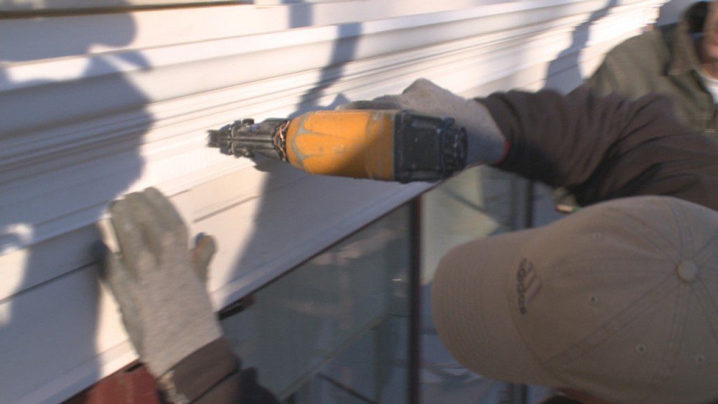








[…] There’s all kind of molding out there. Your paint job is fantastic. The colors obviously look like there’s an eye towards […]
[…] the work as needed, which was great because we used the tool overnight at Cooking Channel’s Save My Bakery so there was plenty of dark and half-light to test it in. The light stays on a full 10 seconds […]