Adding a pop of texture is one of those home improvement projects that don’t require huge cash or time.

It’s not every day that an easy home improvement project could add miles of luxe without breaking your budget or zapping tons of time.
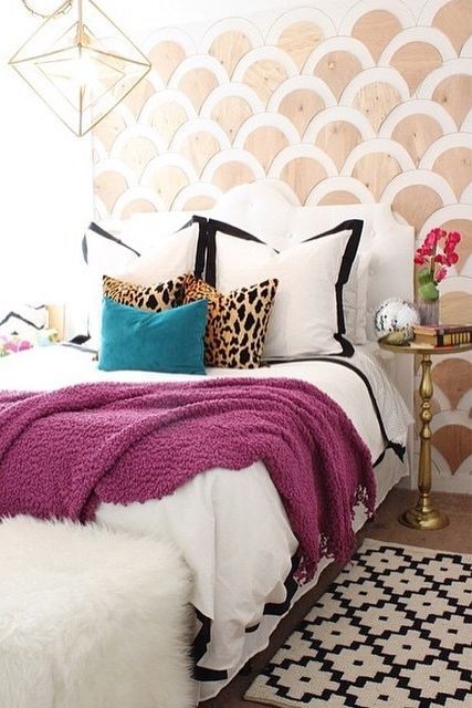
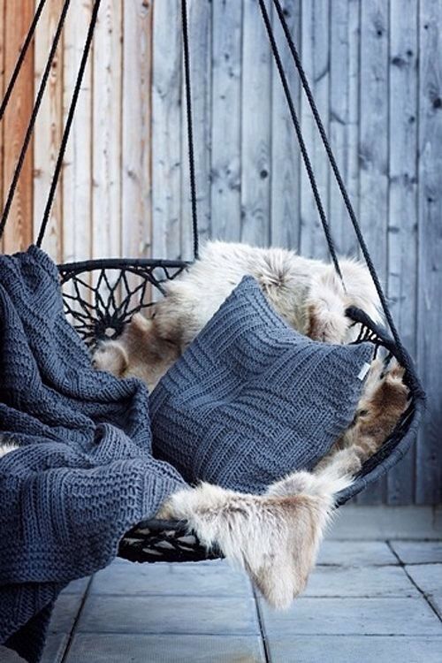
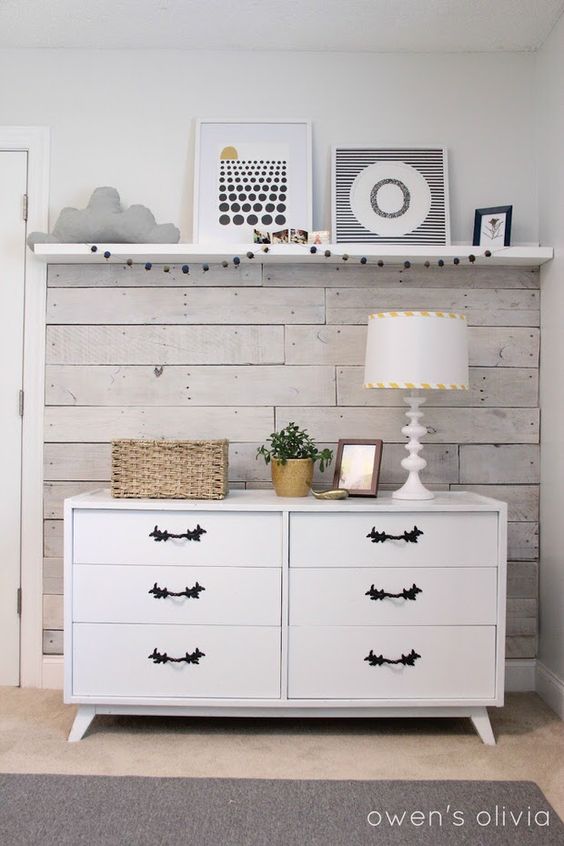
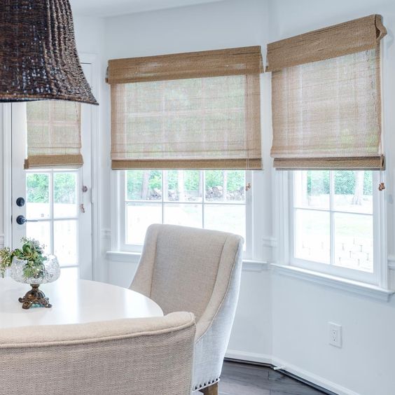
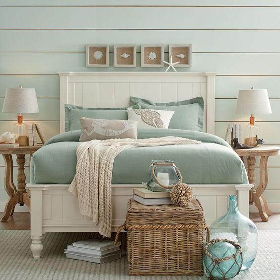
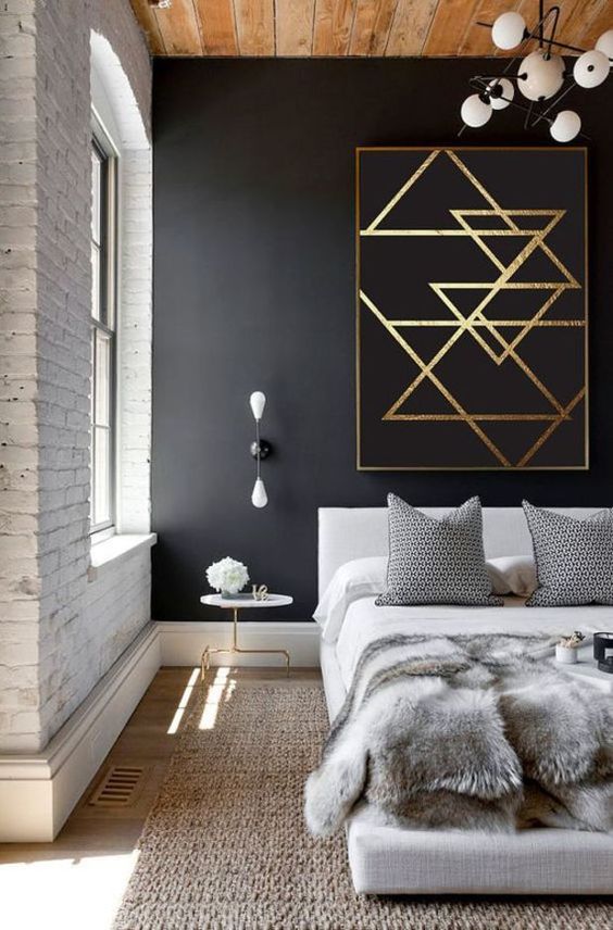
Texture is that secret little fun element that takes a ‘flat room’ and gives it dimension through shadow lines, variations of color, and visual layering of increase depth. Those are all very design-geeky ways of saying that adding texture makes your room look more interesting and therefore more refined.
So what’s a pop of texture?
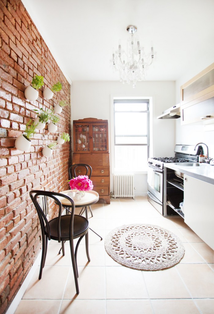
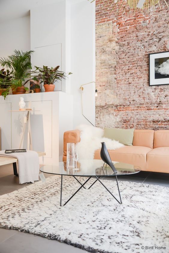
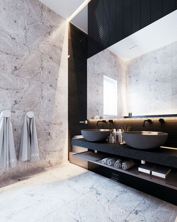
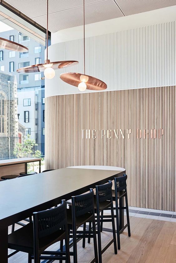
From textured wallpaper and home decor fabric to lighting with interesting materials to wood flooring or wainscoting, there are so many easy ways beyond a plush pillow or rug to incorporate a texture palette into a space.
But, be warned.
Adding too much texture can take a space from polished luxe to a confusing and stressful environment.
Rule of thumb…
Glance at the room in real life (IRL) and if more than 1 thing pops at you, you’ve added too much. Then snap a photo and do the same 1-thing check. Every space needs a star player, and if there’s too much going on it can either become ‘white noise’ or a major source of stress.
I shared a few more pop of texture home improvement tips with Hoss magazine. Please share your questions and comments below, or head over to Twitter and ask me right now. -t



















Great post, Theresa. I really enjoy your post, your useful tips help me a lot. I’m going to try them out with my home remodeling project. Thanks for sharing!