From the moment I saw the periodic table of fonts inside the cover, I knew that I’d love this charming book about fonts.
I’m going to age myself, but when I was in high school, I was lucky enough to take architecture and engineering classes where I got to build a little car, a radio, a bridge, and had to learn the proper way to draw a letters as part of a particular font. When my college architecture courses pressed the same type of standardization of drawing letters upon me with the emphasis on capitals, it became my go-to. I print in what could be considered the standard architect’s font of ‘YELLING.’
This book Just My Type by Simon Garfield opens the five centuries of font history, from learning about sizes of fonts, where names of fonts came from, stories of the font designers, how type was created, how treasured a collection of type was….


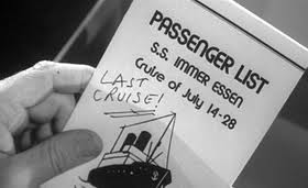
And I now have an appreciation for font aficionados who get frustrated by signs and labels on products in movies and TV because they aren’t from the time period the movie or show is supposedly set. Two of several examples: Steve Martin’s film ‘Dead Men Don’t Wear Plaid’ is set in the 40s, but uses Bippo that was created in the 1970s. LA Confidential uses Helvetica Compressed from 1974 for the ‘Hush Hush’ publication for the movie that was set in the 1950s. For font designers, it’s kind of like having a jet fly by during a scene of the Civil War.

