The secrets of the color wheel.

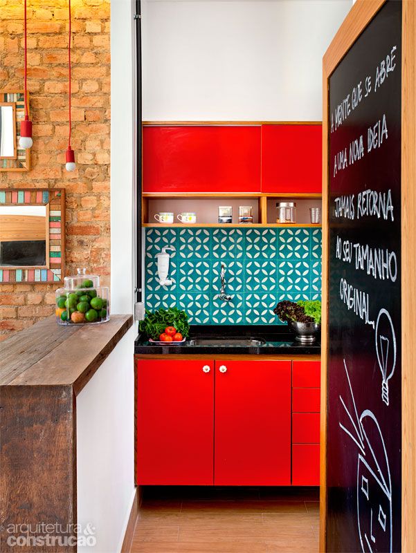
Turquoise and red have the orangey brick and blackboard frame in this view, making it a split complementary color scheme.

If you are a timid with color in your home decor, use the color wheel as a secret decoder ring.
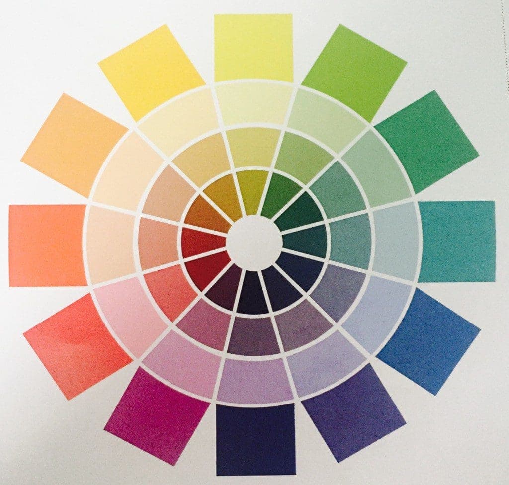
2015_secrets of the Color Wheel_MyFixitUpLife
The color wheel is like a designer’s secret decoder ring.

The secret to the color wheel is that there really are no secrets.

The color wheel is like a carpenter’s speed square, you can use it for as simple or as complex of tasks set before you. I use my speed square to mark boards and check for square, while some of my carpenter-builder friends use it to cut angles for roofs, stairways, and decks.

Let’s start with the color wheel basics, and how this handy little tool can unlock the mystery of why those interior design Pinterest pins are so darn appealing to all of us.

First off the color wheel is a designer’s best friend. It is a guide to selecting colors that ‘go.’ And by ‘go,’ I mean there is never one exact perfect answer to any one question. That’s the art in design. The color wheel guides you to colors that will soothe, colors that will radiate energy, color combinations that will hit that perfect note of your family’s personality.

We asked these questions about the secrets of the color wheel during the #HossColor chat.

  1. When should I use a monochromatic color scheme? Let’s share examples.
  2. How can I use analogous color scheme? Let’s share examples.
  3. When should I use complementary color schemes? Let’s share examples.
  4. Color triads? Nope, I didn’t make this up. Let’s share examples.

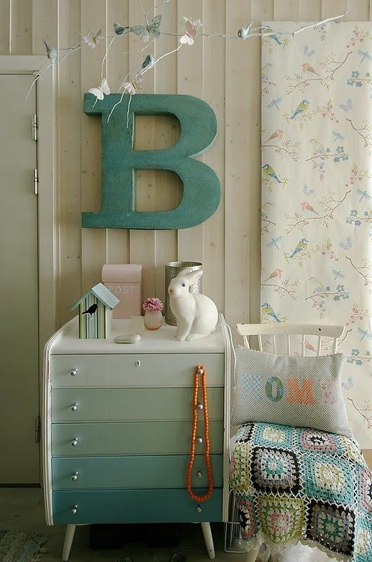
A monochromatic color scheme is fairly easy to remember. It’s a color scheme using just one hue, but varying the value. This color scheme can make a space feel calm and more open. We’ve all seen that ever-popular Pinterest and Instagram DIY project of the drawers painted in the same color, but in different tints or shades. Oftentimes a single color strip is used, and the designer just goes down the strip for the colors. Easy enough, right? (Except for when the paint company includes different base colors for that strip. We’ll talk about this in another chat.)
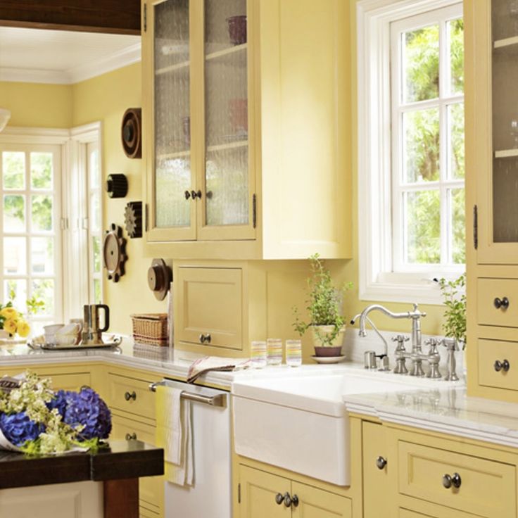
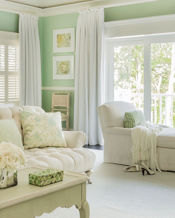
Hello yellow kitchen. Without that little burst of violet, this would be a monochromatic color scheme. The violet gives it a complementary bonus.
A monochromatic look might be the easiest way to create a soothing bedroom escape.
A monochromatic look might be the easiest way to create a soothing little retreat at home.
The painted drawer DIY project is an easy way to try out the monochromatic color scheme.
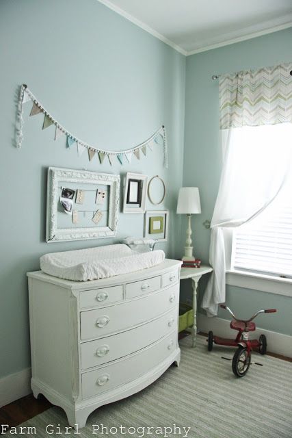
Little nursery is soothing with its mostly all monochromatic colors. The little bike is in the shadows, but I suspect it is a shade of red.

An analogous color scheme is similar-ish in feel to the monochromatic color scheme. Instead of using different shades of the same color, we are using anywhere from two to five color neighbors on the wheel. So looking at the wheel, you could use the green, blue-green, and blue. A very popular look these days.
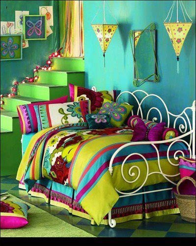
This bedroom might be way too bold for many of us, but it showcases the analogous look with yellow, yellow-green, green, blue-green, blue, and violet. A huge feat in using color.
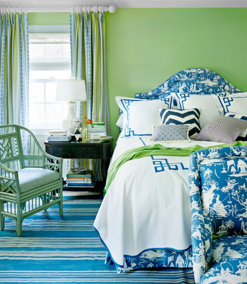
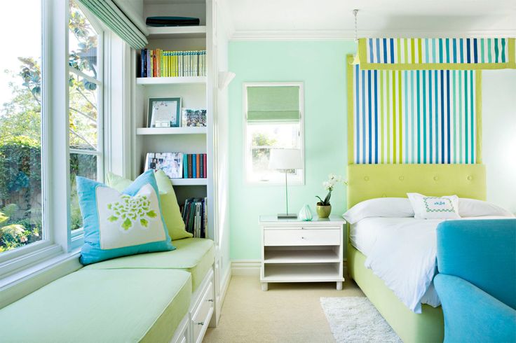
Greens and blues are perfect in the bedroom in an analogous color scheme like this.
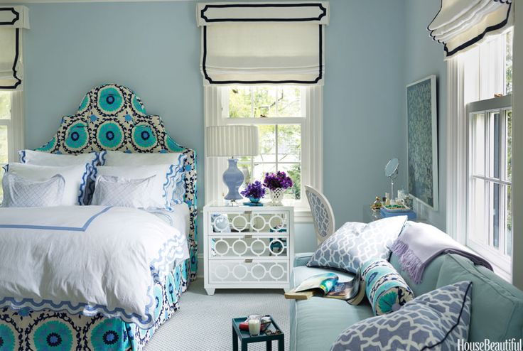
Soothing bedrooms can be perfect for the analogous color schemes. This shows off blue-green, blue, violet.
This little room is an analogous look with yellow-green, green-blue, and blue.
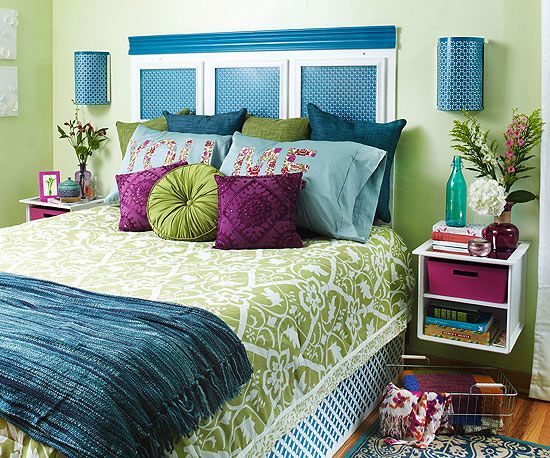
A vibrant look, this bedroom shares the analogous color scheme of purple, blues and greens.
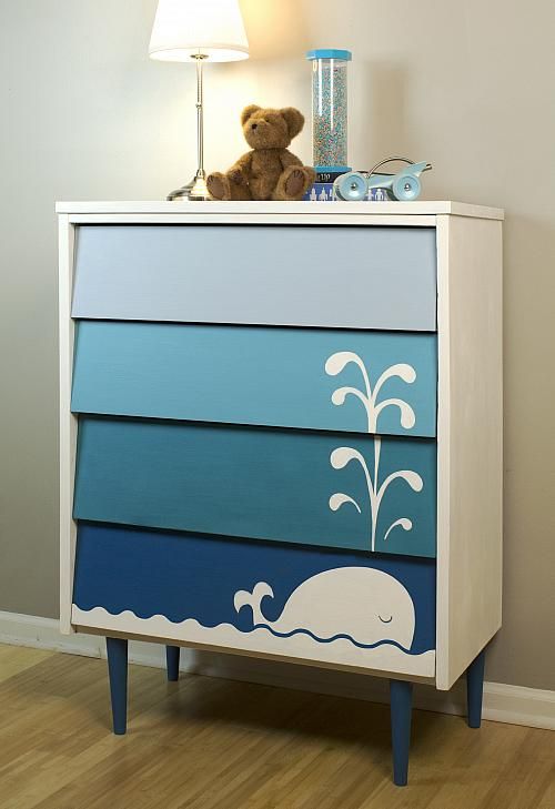
This fun whale dresser is actually an analogous color scheme. It has blue, blue-green, and blue-violet.

Complementary color schemes are quite popular. It’s using colors that are opposite to each other on the wheel. Most sports teams use complementary colors, and a lot of consumer packaging, signage, logos go with this complementary look. It’s a bold way to go in a home, unless you are doing it in a playroom or designing for Katy Perry.
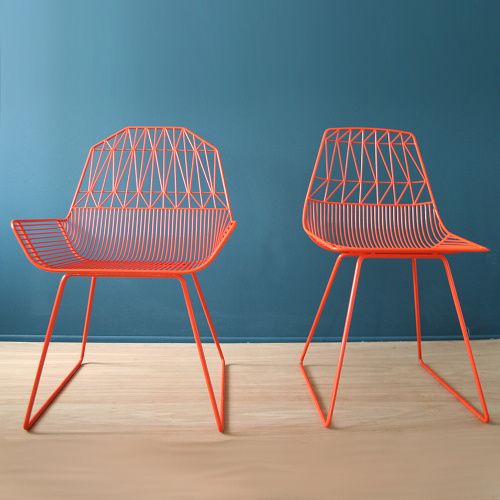
These chairs against the background are a perfect vision of complementary colors.
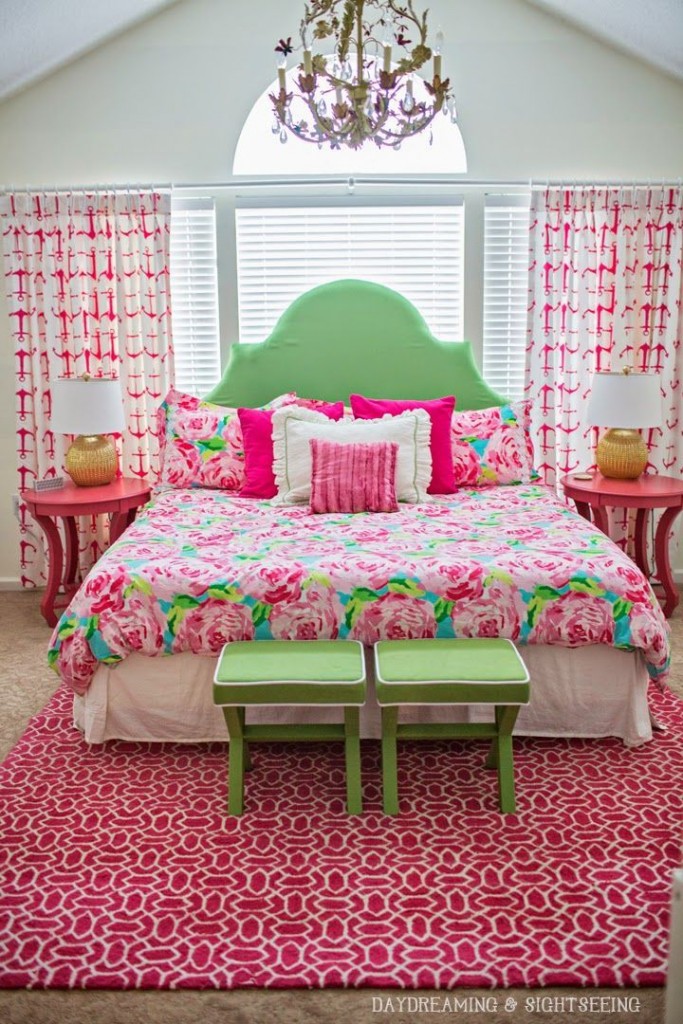
Bold pink and green are a complementary color scheme that goes way beyond Strawberry Shortcake. The little lamps add that bit of orange-yellow to turn this into a triad color scheme.
Turquoise and red have the orangey brick and blackboard frame in this view, making it a split complementary color scheme.

Color triads are real. Select three colors that are evenly spaced from each other around the wheel, and you’ll have made your first color triad. Concepts like cool and warm colors, plus tones and tints will factor into how successful you’ll feel working with a color triad. But, it’s worth playing around with. You never know what you like in the world of design unless you give into your inner curiosity and play a bit.
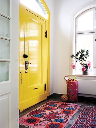
Yellow, violet and red-orange combine for an energetic triad color scheme in this entryway.
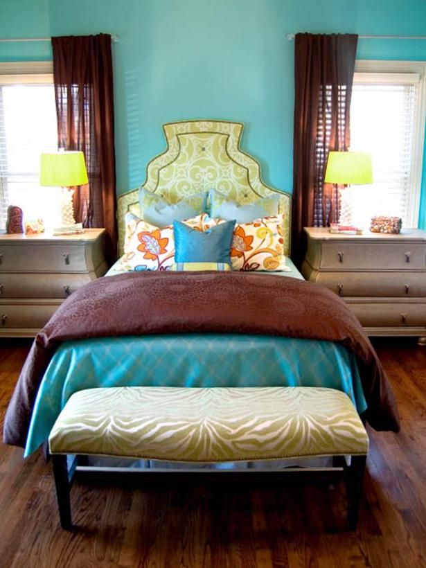
This bedroom is a color triad of yellow, red-orange (brown), and blue-green. Neither too masculine nor feminine, but tons of personality and a bit luxe.
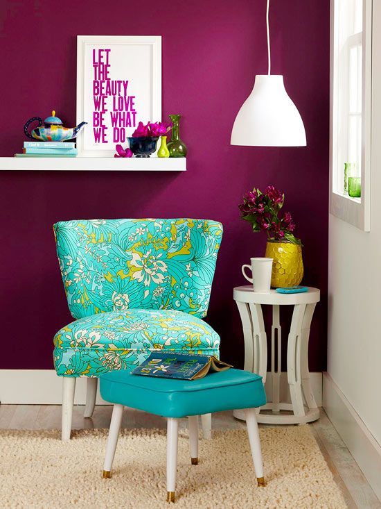
Fun little spot to read a book. With the red-violet, yellow-orange, and blue-green, it's a triad color scheme.
Fun little spot to read a book. With the red-violet, yellow-orange, and blue-green, it’s a triad color scheme.

I’d love to know your favorite color schemes. Please share below or send me a note.

We’ll be on break during the holidays, but I’ll be hosting #HossColor Wednesdays at 1:30pmET starting in January.

Share your questions about color, and we’ll make sure to create a chat designed to help you. -t


Related Posts

Comments (2)

Highly descriptive article, I loved that bit.
Will there be a part 2?

[…] you are a color geek like me or passionate about Pinterest and shelter magazines like Hoss magazine, this isn’t a […]

Leave a comment

Verified by MonsterInsights